
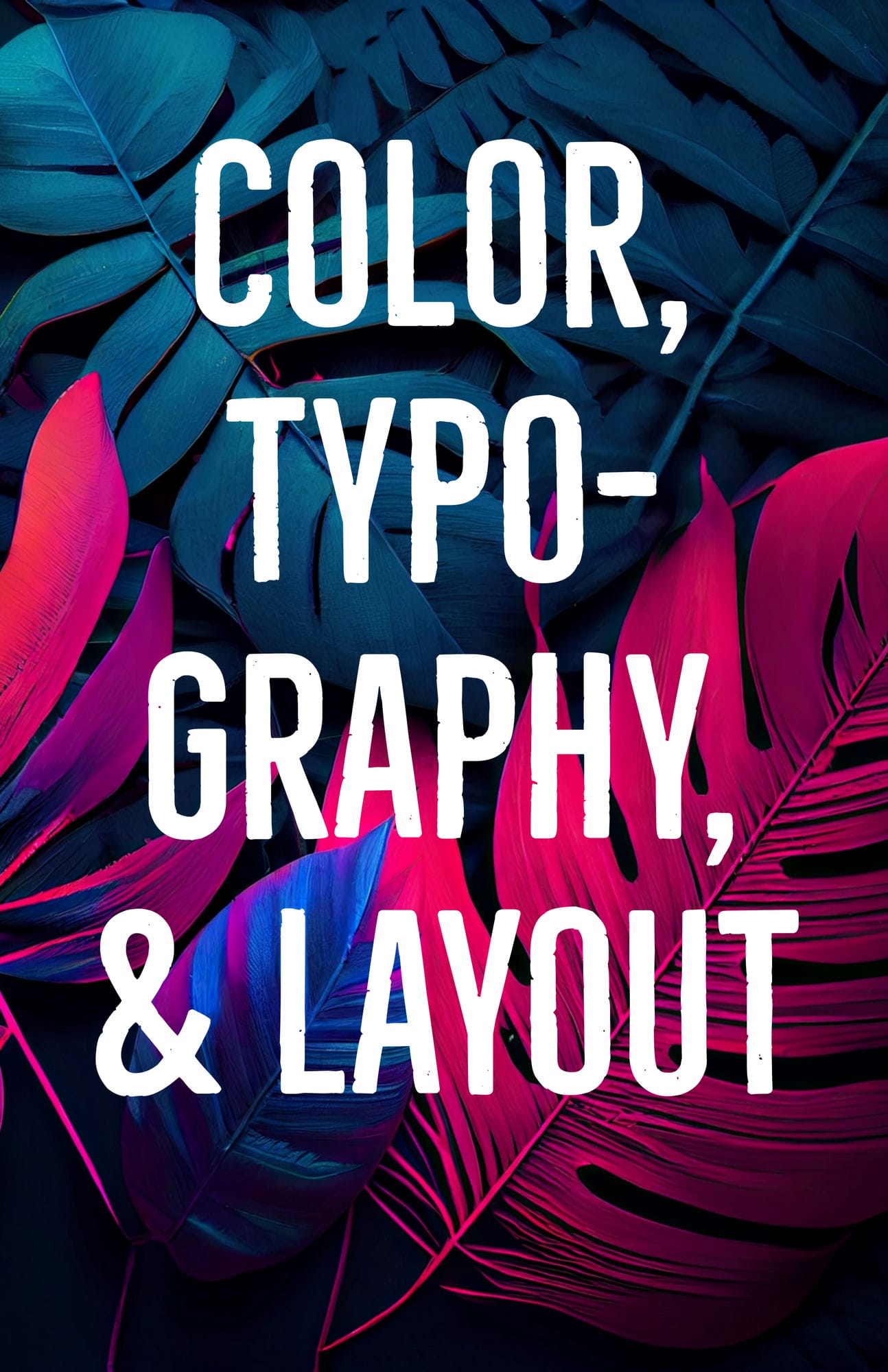
In the ever-evolving world of web design, aesthetics play a crucial role in shaping user experience, engagement, and overall brand perception. A visually appealing website not only captivates visitors but also enhances usability, making it easier for users to navigate and interact with the content. Among the most critical elements that contribute to an effective and aesthetically pleasing web design are color, typography, and layout. These three components work together to create a harmonious visual presentation that reflects your brand’s identity and values. In this comprehensive guide, we will take a deep dive into the world of web design aesthetics, exploring the importance of color, typography, and layout in crafting visually stunning and user-friendly websites.
The Power of Color
Color is a vital aspect of web design that greatly impacts user experience and engagement. A well-thought-out color scheme can evoke specific emotions, facilitate navigation, increase conversion rates, and promote brand recognition.
Color Psychology
Understanding color psychology is crucial for selecting the right colors for your website. Different colors can trigger different emotional responses, influencing user behavior and perception. For instance:
- Red is often associated with passion, excitement, and urgency – making it an ideal choice for call-to-action buttons.
- Blue conveys trust, stability, and professionalism – which is why it is commonly used in corporate and financial websites.
- Yellow symbolizes warmth, optimism, and happiness – attracting attention and promoting positive feelings.
- Green represents growth, balance, and eco-friendliness – suitable for environmental causes and health-related brands.
Bear in mind that cultural factors and personal experiences can also affect how people perceive colors.
Color Schemes
An effective color scheme should include a limited number of colors that complement each other and create a harmonious visual experience. A combination of 2-4 colors is usually sufficient. Some popular color schemes are:
- Monochromatic: Variations of a single color. Creates a clean and minimalist look.
- Analogous: Colors that are adjacent to one another on the color wheel. Provides a sense of harmony and balance.
- Complementary: Colors that are opposite each other on the color wheel. Offers high contrast and visual interest.
- Triadic: Three colors equally spaced around the color wheel. Adds vibrancy and energy to the design.
Consistency and Accessibility
Maintaining consistent colors across your website reinforces your brand identity and creates a cohesive user experience. Additionally, ensure your color choices are accessible and provide ample color contrast to accommodate users with visual impairments and meet web accessibility standards.
Typography: The Art of Words
Typography is the art of arranging text to make it legible and visually appealing. It plays a significant role in conveying your brand’s personality and improving user experience.
Font Selection
Choose fonts that reflect your brand identity and are easy to read. Limit your design to 2-3 typefaces to maintain consistency and avoid visual clutter. Popular font categories include:
- Serif fonts: Traditional and conservative. Used primarily for body text.
- Sans-serif fonts: Modern and sleek. Often used for headlines, titles, and call-to-action buttons.
- Script fonts: Elegant and playful. Ideal for special occasions or creative projects.
- Decorative fonts: Unique and eye-catching. Often used for logos or special elements.
Font Sizing and Spacing
It is important to consider font sizing and spacing when designing your website. Your text should be large enough for users to read comfortably, while providing ample white space between elements to improve legibility and create a sense of harmony.
Layout: Organizing Your Website
Layout is the process of organizing content on a website to create an intuitive and enjoyable user experience. A good layout should be visually appealing, clearly communicate the purpose of each page, and guide users through your website with ease.
Grid System
A grid system consists of rows and columns which divide a webpage into sections, allowing you to easily arrange elements and create a balanced design. It also makes it easier to maintain consistency across your website and ensure all elements are aligned correctly.
Flexible vs Fixed Layouts
A fixed layout has a fixed width, regardless of the device or screen size – while a flexible layout adjusts according to the device and screen size, providing an optimal viewing experience.
Flexible layouts are more popular as they are easier to use and create a better user experience. However, fixed layouts can be useful if you want to maintain control over how your website looks on different devices and screen sizes.
Visual Hierarchy
A visual hierarchy is the order in which elements are presented on a webpage – with the most important elements being the most visible. It is essential for communicating your message and guiding users through your website.
Using size, color, position, and other design elements like images and typography can help you create a clear visual hierarchy and improve user experience.
Additional Resources and Tips
Web design is a complex topic and there are many resources available to help you learn more. Here are some tips for getting started:
- Research current trends in web design to stay up-to-date on best practices.
- Use online tools like websites, blogs, and tutorials to practice and improve your skills.
- Follow industry experts and designers on social media for the latest news, tips, and updates.
- Ask questions and seek feedback from peers to get a better understanding of web design principles.
- Experiment with different techniques to find out what works best for your project.
- Remember that even the most successful websites are constantly evolving – stay open to new ideas and trends.
Wrapping it up
While there are plenty of resources available to help you build an effective website, it can be difficult to know where to start or how best to implement these ideas in your own project. At Graticle Design, we have years of experience designing websites that meet web accessibility standards while also being visually appealing and easy-to-navigate for users. With our expertise, we will work with you every step of the way – from concept creation through launch – so that your website meets all of your needs now and into the future. We also provide ongoing maintenance and optimization services to ensure that your website continues to perform at its best. Contact us today for more information and to get started on your custom website project! Call (360) 450-3711 today!


