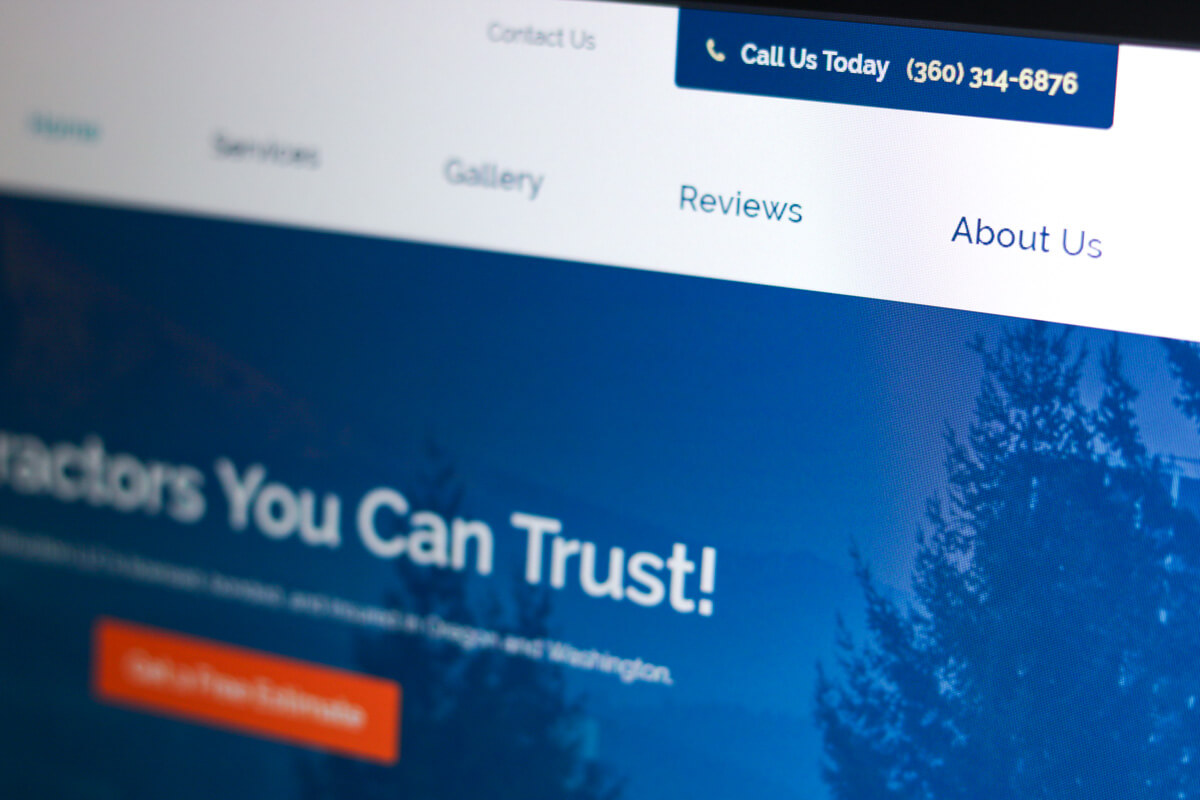
In this web design spotlight, we’ll be looking at a website we created for a construction company, New Vista Construction, LLC. In Vancouver, Washington.
When New Vista Construction first approached us, they didn’t have a website. They also didn’t have a large budget, but they knew they needed to get their business online.
A Graticle, we provide a few different website packages. For New Vista Construction, our Pre-Made Small Business Package was the optimal choice. This package includes a six-page professional, modern and mobile-friendly website. It has a variety of features to help make a website more effective. Those features include, calls to action, contact forms, and a professional design.
When we originally built our Pre-Made Small Business Package, we took all the great parts from our custom website projects and implemented them into this package. The great thing for the customer, is that they get a website that works for them at a lower cost. The website is premade, so it’s less labor on our side and that’s why we can charge a lower price for the package.
Let’s look at the website we created:
Easy to Use Navigation
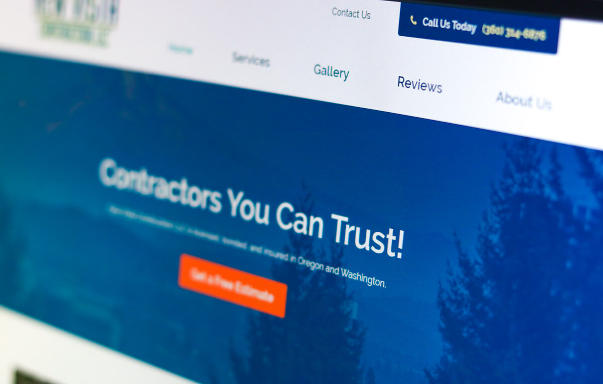
As you can see, the primary navigation is simple, and easy to use.
Hero Area
 The hero area is clear and to the point. It also includes a get a free estimate button allowing people to take action immediately on visiting the website.
Call to Action

There is a call to action at the top-right portion (header) of every page. The phone number is always available for visitors, as is the link to the contact page.
Contact Form On Every Page
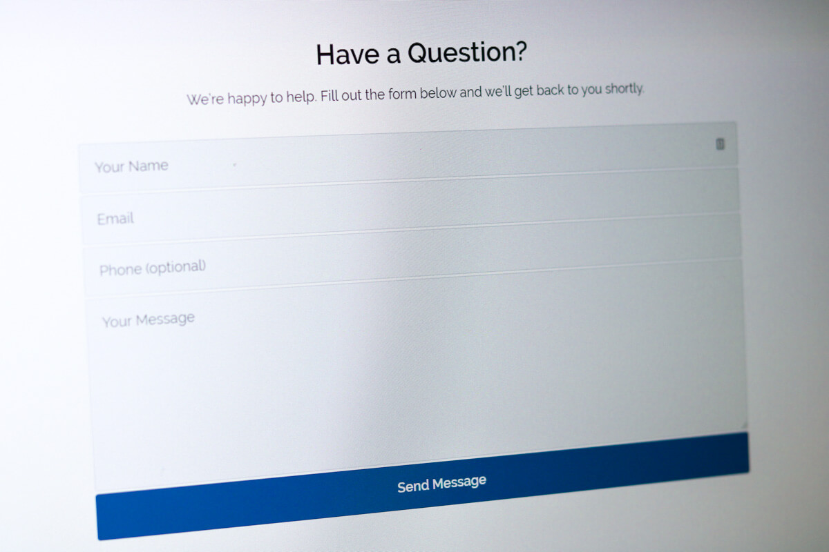
At the bottom of each page, is a contact form. This allows a visitor to quickly send their question to the customer. Again, this is on every page. This is important because you never know where a visitor is going to come from when they land on your website. You may think that a visitor will land on your homepage, click your about page, look at your services, and then go your contact page. It’s hardly ever this linear. In the case that someone lands on any interior page, at the bottom of that page is a contact form. If someone does have a question, they are more likely to fill out this form since it was shown to them. It’s a lot more effective than hoping the user clicks on the contact page and then fills out that form. You always want to make it easy for the visitor to take the next step.
Redundant Contact Information
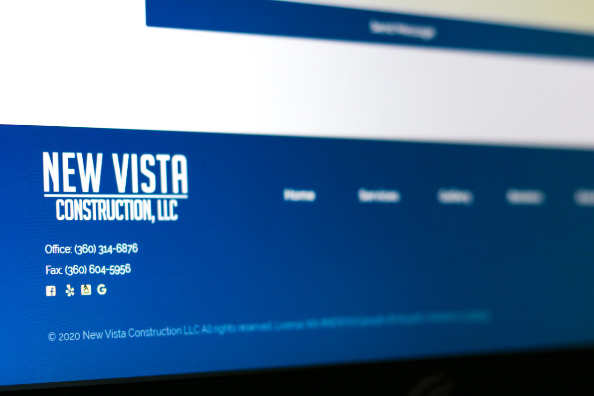
Their contact information is also reiterated in the footer on every page. With contact information, you can never be too redundant. You always want contact information to be readily available.
Services Page
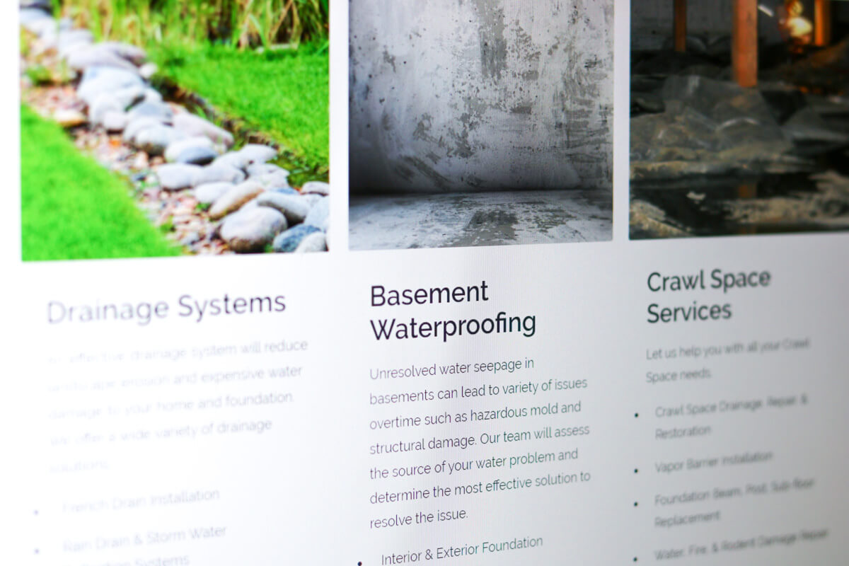
On the services page, it’s straight forward. The visitor can see each of the services that the contractor provides along with a corresponding image. Not a lot of bells and whistles, but it’s easy to navigate.
Photo Gallery
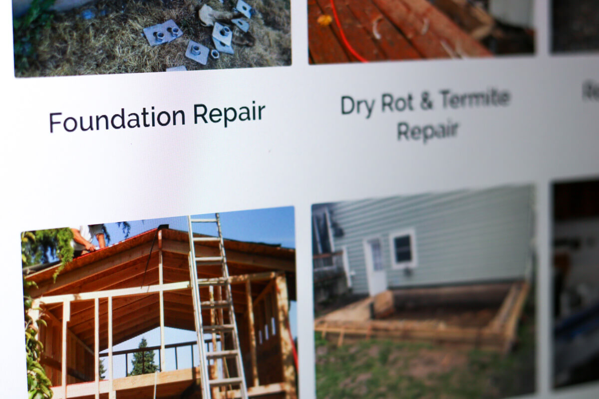
They also have a photo gallery, which is a portfolio for the company. Visitors can click on the gallery they are interested in, and see project photos.
Reviews
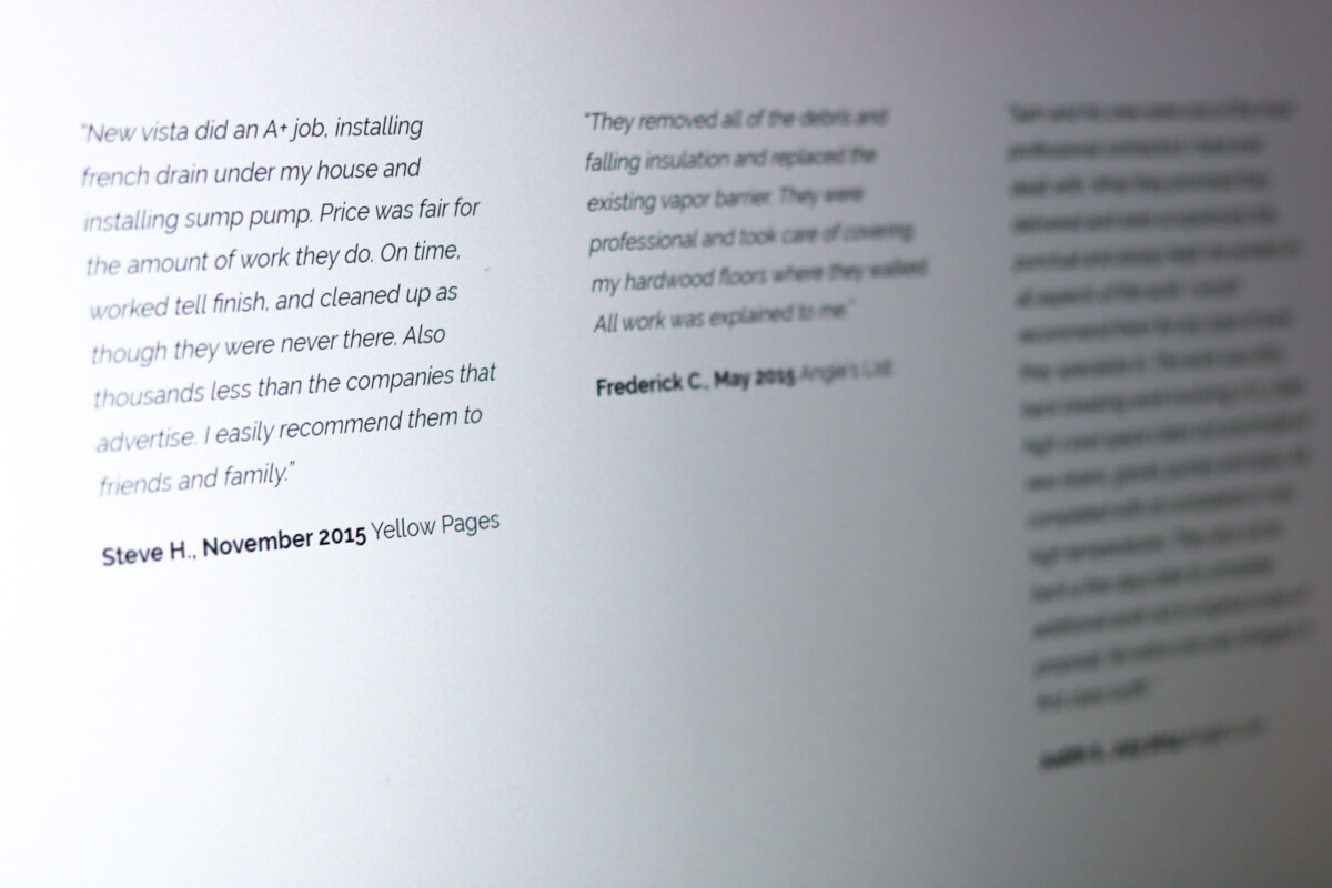
Another important item is the reviews page. It’s always crucial to have social proof on your website. People want to read experiences from actual customers.

Also, on the reviews page, are links for their visitors to leave reviews on Google, yelp, Angie’s list, and Facebook. This allows new Vista construction to easily ask for reviews from their customers. Rather than, asking their customers to find their yelp page, they can simply ask their customers to go to the reviews page and click the review us on yelp link. This in turn allows the company to get more online reviews.
Contact Page
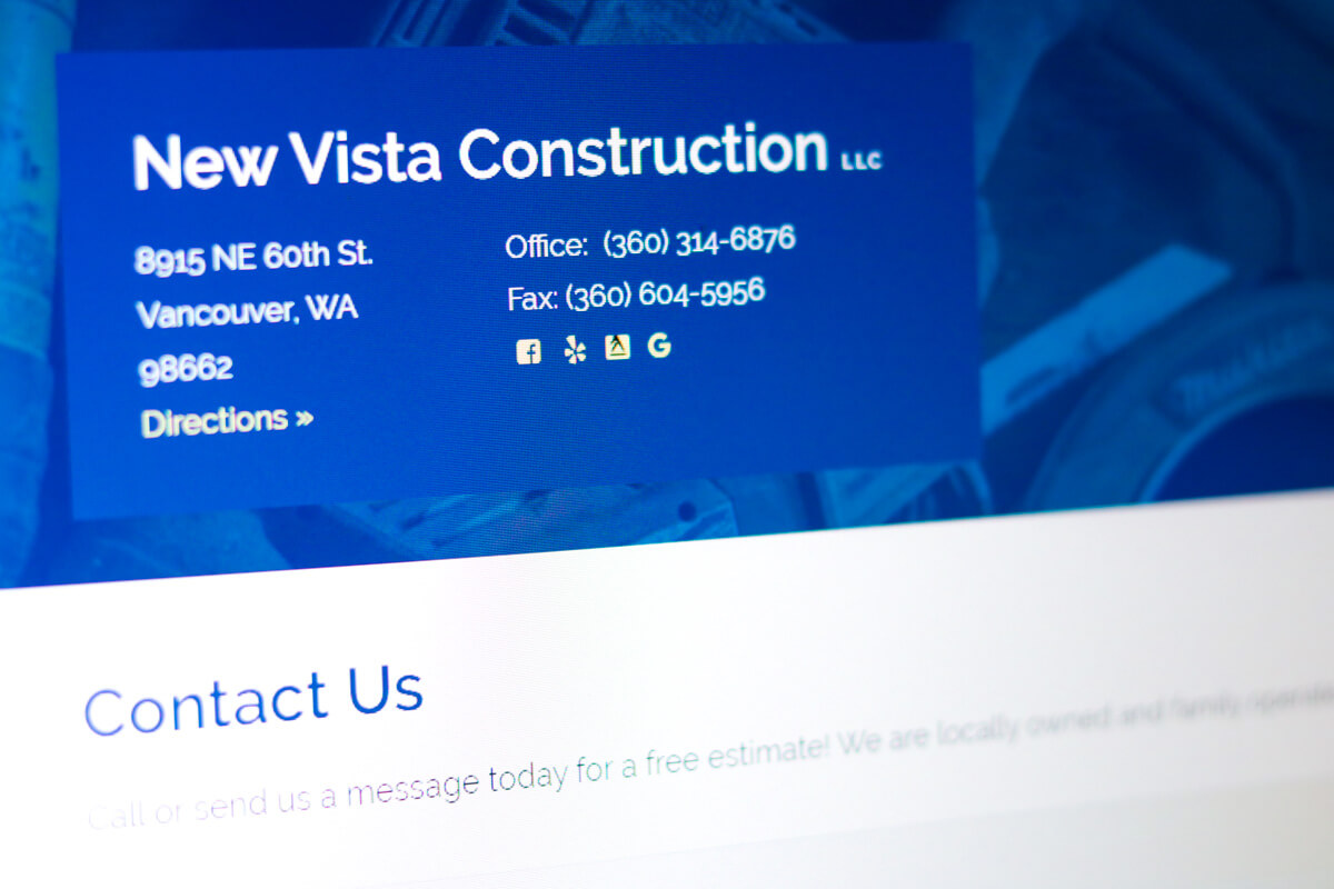
Finally, on the contact page we have all of New Vista Construction’s contact information. This includes phone, fax, address, link for directions, and social media channels where visitors can stay in touch with the company.
Construction Web Design Services
Do you need a new website for your construction business? Or maybe you need updates to your existing website? Either way, we can help. Call or text us (360) 450-3711 or Request a Quote. We have many options in order to accommodate our customers.


