
I know. It’s difficult enough staying in front of your existing projects, much alone, time to sit around and think about how your website could be improved, or getting a new website altogether.
Yet, here we are!
I imagine you’re looking for examples of other good contractor or construction websites.
Sure, it can be easy to look up your competitors, see what they have and more or less copy elements from each. The problem with that method is that your competitor’s website isn’t exactly a benchmark. For all you know, their nephew knew how to “create websites,” threw together the logo, some content, a few images and called it a day.
This happens a lot. Companies are all just copying ideas from each other and more or less have similar websites that are terrible. It’s the sad truth.
Don’t believe me?
Just look at contractor websites in your area. You should be able to tell most don’t know what they’re doing.
Let’s change that by showing you examples of contractor websites while I point out the good and the bad from each. I’ll also include an educational explanation for each so you can get an idea about my thought process.
Enough talking, let’s get into it!

L.E. Burgess – Vancouver, WA
This website is a great example of allowing visitors to contact your construction company. Not to mention, asking them to contact you.
At the top-right of the screen is their phone number with two of their services listed above, including the areas served. If the customer glances at this, they now know if you offer the service they are after, and also if you serve their area. They also have their phone number at the top-left of the screen. Also, a “Get a Home Inspection” button is loud and clear with the green button below the phone number. More than likely, home inspections are one of their primary sources of revenue.
Below the image slideshow, there is a “Get Started Today” button. This allows someone to take action if they are ready now. That’s something to remember for each one of your web pages. You should always ask the customer to take action somewhere on your page or in your content. The last thing you want to do is get a visitor excited and then leave them to figure out how to contact you. Don’t worry about being redundant.
If you continue scrolling down, you see a list of their services with clickable photos. This is great, because visitors are going to be interested in not only if you provide a particular service, but also the final product of which you’ve worked on previously. On that note, the more photos the better throughout your website. By the way, steer clear of stock photos as much as possible. People can tell that random person smiling in the photo doesn’t actually work for your company. Stock photos are overused just about everywhere online.
Keep in mind that most everyone is busy. You should cater to both the skimmer and the detailed oriented person. You can do that by providing chunks of information and allowing them to click to learn more. Imagine having a conversation with someone in real life. If someone asked what your company does, would you talk non-stop for 10 minutes? No, you’d give them the most important information and if they asked questions, you’d answer those questions. The web is no different.
If you continue scrolling down the page, there is a contact form that you can fill out to immediately ask a question to the company. This is something we’ve found to be extremely effective with our customer’s websites, because the visitor doesn’t have to hunt for the contact form, instead they are presented with it. You’re effectively saying “Hey! Do you have a question I can help you with?” just as you’d do if they walked into your office.
The website is also mobile-friendly, so people can easily use the website on mobile as well as desktop devices. Besides that, Google also ranks websites that are mobile-friendly higher in the search results.
As for improvements, the design is a bit scattered and inconsistent on this website. I’d look at improving the overall consistency of the design. It could also use more personality and a bolder look, something that leaves a lasting impression. Lastly, I’d add an SSL certificate to help increase search results and protecting your user’s privacy while on your website.

Mosaik Design & Remodeling – Portland, OR
This website contains personality. It’s likely that you won’t see another website quite like it, especially in their industry. It’s unique, and unique is memorable.
The first thing I like is the statement on the homepage “we design it. we build it. you love it.” It doesn’t get more succinct than that. Now you know they both design and actually do the remodeling service you’re after which makes you not only more confident in their abilities but also, you don’t have to design it yourself.
The first link is a link to their Portfolio. Most likely, one of their most popular pages on their websites, so why not give the visitor that option right away?
If you scroll down, you’re presented with a list of each service they provide with an accompanying photo.
Below that, two reviews from previous customers. This shows social proof. Anyone can claim to be the best at anything, but when others agree and support your customer with a review/testimonial that speaks a lot louder than any claims you can make about your business.
In the footer (the bottom of the website) they list all of their awards that they’ve received and the organizations they are a part of. A lot of awards are from Houzz and this tells me that this company is up-to-date with their online presence by not only being on Houzz but actively managing their Houzz presence and getting awards there. If you want a more modern design for your bathroom remodel, you can be sure this company is going to provide all of the latest design options.
One item I’d improve is the phone number at the top-right of the screen. For one, it’s only hyphenated. In my opinion, a phone number should always look like a phone number. For instance (360) 450-3711 instead of 360-450-3711. It’s a minor detail, but when your visitors have the attention span of a fly, quick recognition of a phone number is critical. With the phone number, I’d also include a call to action. Something like “Have a question? We’d love to chat about your project.” Better yet, if your phone number can text message “Call or Text Us Today.” Either way, ask the visitor to call you, don’t just show your phone number. Another tip is listing your hours with your phone number, so if they are looking your website during business hours and can quickly see that you’re open, that may be what pushes them to pick up the phone.
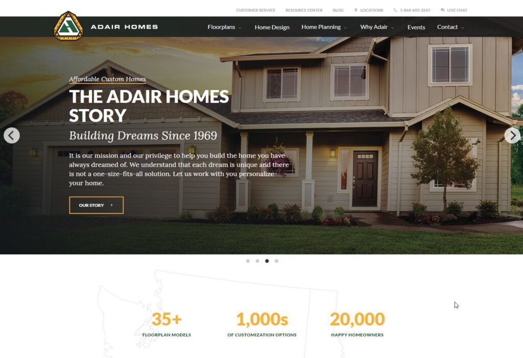
Adair Homes – Portland, Oregon
What a polished website. The attention to detail is inspiring.
On that note, this website was a much larger investment than the prior websites. Most likely, this company has a team that works on this website daily.
With that, let’s go over the positives:
The design consistency is spot on. The website has a very professional and fresh look. Everything feels right.
The website has also been well thought out. This company didn’t just put things together and see how it looked. They thought through the customer’s eye and the situation they are in now along with how they can best answer questions in the prospect’s mind.
The first thing you see on the website is a brand-new home with a few reassuring statements along with their mission and history of the company. This is accomplished in a few sentences. It provides just enough information for the visitor to decide if they want to move forward and establishes trust. You also have the option to read their story if you want to dig in further. Often, we want to provide all of the information possible to our visitors, but you can’t do that. You have to remember that people really don’t care about your company, they care about their own needs, that’s all. They have a problem and they need it solved in a professional manner.
Take a look at the navigation on the page. It’s well organized and also includes their phone number and live chat. You really don’t have an excuse for not moving forward when you’re ready.
As you scroll down, you can see the number of models they offer, customization options and a statement about the Pacific Northwest. All subtle ques to help you feel comfortable that they have what it takes to solve your problem.
Below that, they have photos of all the types of homes with an option to click and learn more.
At this point, you could have ignored the menu at the top and still have most everything you’d be interested in.
Below the home options is a picture of a family in front of their new home. This is a great example of social proof. The only thing better could be an actual video of the family talking about their experience and walking through their new home.
There’s more content as you scroll down the page, with a repeat of their contact information. Again, redundancy doesn’t hurt.
The website is also mobile-optimized and also has an SSL certificate installed.
There’s not a whole lot of complaints from me with this website for the above reasons. Of course, everything can be improved in one way or another, but they’ve done an excellent job with this website.
The one item I’d recommend is video. A video walking people through the process of where they are now to the result would be nice. Possibly a testimonial video doing something similar, but with the homeowners front and center explaining their experience.
If you want to look at a benchmark for a contractor website, this it is.
Wrapping It Up
The point of this post is to show you examples of contractor and construction websites that stand out from the crowd. You don’t have to lower the bar for your website just because your competitor’s websites are mediocre. It’s only a matter of time before they do start focusing on their website and you want to be ready when that time comes.
Some may also argue that they don’t need a website at all. But you have to remember, Houzz and similar companies are their own playgrounds. A place the bad-review-troll will stop by eventually. You can control certain aspects of those channels, but in the end, it’s not yours. It’s a third-party service. And as popular as they are today, it’s only a matter of time before they don’t exist.
Want to Learn About Our Contractor Web Design Service?
You can read about our custom web design and development service here.
You can call or text us (360) 450-3711, too. We’re always happy to help!
Thank you for reading!


