
Landing pages aren’t just another page on your website. They’re your online pitchman, your closer, the handshake that seals the deal. When built right, they do one thing incredibly well: convert visitors into leads or customers.
At Graticle Design, we’ve helped businesses in the Pacific Northwest turn their underperforming landing pages into conversion machines. In this post, we’ll break down exactly how to design landing pages that actually sell—with real-world tips, proven strategies, and no fluff.
Why Landing Pages Matter
Think of your landing page as a focused funnel. Unlike your homepage or about page, it has one job: guide visitors toward a specific action. Whether it’s filling out a form, booking a consultation, downloading a guide, or making a purchase, your landing page exists to prompt that single behavior.
A high-performing landing page can:
- Reduce bounce rates
- Boost ad campaign ROI
- Build trust faster
- Generate more qualified leads
Yet most landing pages don’t live up to their potential because they’re trying to do too much. The good ones? They stay focused.
1) Start with a Clear, Specific Goal
Before you design anything, get clear on what this landing page is meant to do. Not what you want it to do eventually, but the one action you want a visitor to take on that page.
Are you trying to:
- Get signups for a newsletter?
- Book a free consultation?
- Sell a product?
- Offer a downloadable guide?
You can’t design a great landing page without a specific goal. Vague goals lead to vague pages. And vague pages don’t convert.
Tip: If you have more than one goal, create more than one landing page.
2) Know Your Audience Inside and Out
You can’t write or design for everyone. You have to tailor your landing page to the exact person you want to attract.
Ask yourself:
- What problem are they trying to solve?
- What questions or hesitations do they have?
- What words do they use to describe their needs?
- What makes them feel confident in a solution?
The more you understand your audience, the more persuasive your landing page becomes. Use their language, not yours. Solve their problem, not your sales goal.
3) Write a Headline That Speaks Directly to a Benefit
Your headline is the first thing they’ll read. And if it doesn’t grab them? They’re gone.
A great headline:
- Highlights a clear benefit
- Sparks curiosity or urgency
- Speaks in plain language
- Feels specific, not vague
Examples:
- “Save 10+ Hours a Week With This Free Scheduling Tool”
- “Get a Custom Logo Design That Turns Heads—In Just 5 Days”
- “Fix Your Leaky Roof Before the Next Rainstorm”
Avoid:
- “Welcome to Our Page”
- “We Offer Quality Solutions”
- Anything with the word “innovative”
4) Support It with a Powerful Subheadline
A good subheadline:
- Adds detail or context to your main promise
- Addresses a pain point or objection
- Encourages the reader to keep scrolling
Example:
Headline: “Build a Website That Actually Works For You”
Subheadline: “We design fast, user-friendly WordPress sites that help small businesses in Longview and Vancouver get found on Google.”
5) Use a Clean, Focused Layout
Here’s how to structure your landing page layout:
- One goal
- One call to action (repeated if needed)
- Minimal navigation (if any)
- Logical content flow (top to bottom, left to right)
- Ample white space
Bonus Tip: Make sure your CTA button stands out visually.
6) Include Only the Most Relevant Information
Include only what directly supports the goal:
- What the offer is
- Why it matters
- Who it’s for
- Social proof
- Trust signals (like guarantees or client logos)
- A clear, simple form or CTA
7) Use Visuals That Reinforce (Not Distract)
Effective visuals include:
- Product images
- Before-and-after comparisons
- Diagrams
- Screenshots
- Custom illustrations
- Short videos or demos
Pro Tip: Use a testimonial video to boost trust.
8) Write Clear, Simple, Persuasive Copy
- Short sentences and paragraphs
- Focus on benefits
- Speak conversationally
- Use bullet points
- Address objections
Bad: “Our platform utilizes state-of-the-art technology to synergize workflows.”
Good: “Easily manage your data without tech headaches.”
9) Create a Strong, Action-Oriented CTA
Make it clear and compelling:
- “Start Your Free Trial”
- “Book Your Consultation”
- “Download the Guide”
- “Get a Quote Today”
10) Remove Navigation and Minimize Exit Options
- Remove top navigation
- Hide footers
- Avoid outbound links
11) Use Social Proof Strategically
- Short testimonials
- Client logos
- Ratings
- Data-driven case studies
12) Build Trust With Transparency
- Business name & contact info
- Privacy policy near forms
- Clear guarantees
- Team bio or photo (optional)
13) Optimize for Mobile
- Load speed under 3 seconds
- Large tap targets
- Easy-to-read fonts
14) Keep Your Forms Short and Sweet
Only request what’s needed. Fewer fields = more conversions.
15) Test Everything (Then Test Again)
A/B test:
- Headlines
- CTA copy
- Visual layout
- Testimonials vs. data
16) Set Up Conversion Tracking
Use Google Analytics or Tag Manager to track:
- Form submissions
- Click-throughs
- Time on page
17) Match Your Ad Copy to the Landing Page
Consistent messaging between ads and landing pages = lower bounce rates.
18) Don’t Forget the Thank You Page
Use it to:
- Confirm their action
- Offer a next step
- Set expectations
19) Keep Improving Over Time
Regularly review your landing pages to keep them aligned with your brand and customer needs.
Want a landing page that actually performs?
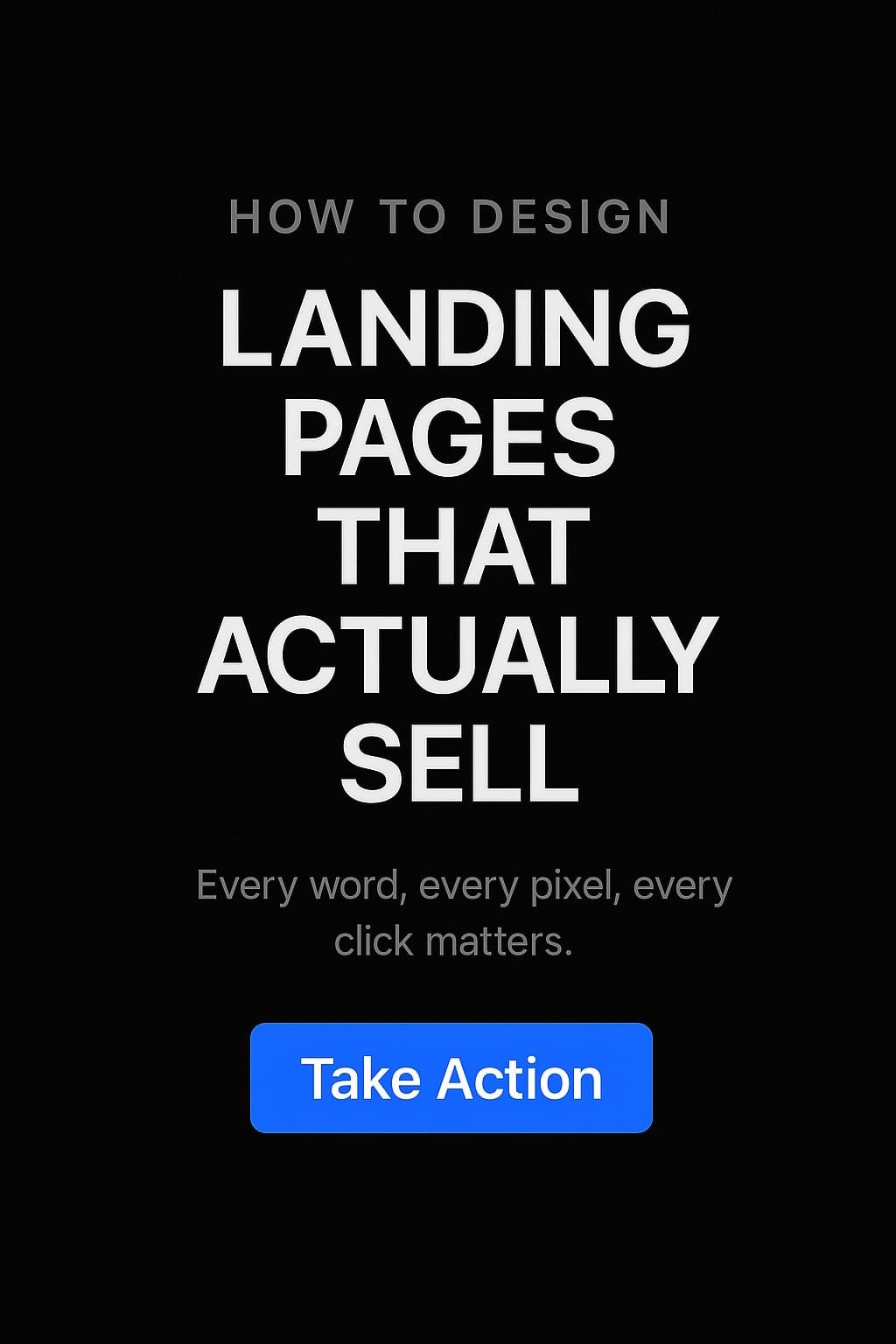
Designing a landing page that actually sells takes more than a pretty layout. It takes strategy. Every word, every pixel, every click matters.
At Graticle Design, we build landing pages that turn browsers into buyers. Whether you need a new page from scratch or want to optimize one that isn’t working, we’re here to help.
Reach out today and let’s talk about building a page that works just as hard as you do.


