
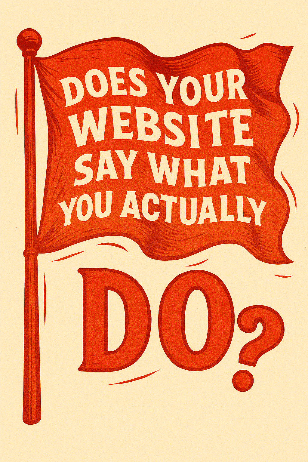
When someone visits your website, do they know what you offer in under five seconds?
If you’re not sure, you’re not alone. We’ve worked with hundreds of businesses—contractors, industrial suppliers, healthcare providers, and service companies—who had websites that looked fine on the surface but left visitors scratching their heads.
The truth is: if your website doesn’t clearly communicate what you do, who you help, and how you’re different… you’re leaving money on the table.
1) The Clarity Test: Can a Stranger Understand It?
The average visitor to your website is not familiar with your industry jargon or your history. They don’t know your team. They don’t know your mission. They’re skimming your homepage with one question in mind:
“Can this company help me?”
Try this: Show your homepage to someone who doesn’t know your business. Give them 10 seconds. Then ask them to describe:
- What your business does
- Who you serve
- What makes you different from your competitors
If they can’t answer all three, your website might be confusing potential customers—and pushing them toward your competitors.
2) What We Usually See (and Why It’s a Problem)
Here’s what we often see when reviewing websites for businesses across industries:
- Generic headlines like “Welcome to Our Website”
- Industry buzzwords that don’t mean much to everyday people
- No mention of location or service area
- Vague services listed without real-world examples
- Missing call to action or next step
Even businesses with incredible reputations and decades of experience fall into this trap. They know what they do so well that they forget to explain it in simple terms to outsiders.
3) Start With a Clear Headline
The headline on your homepage should do the heavy lifting. It should:
- Say what you do
- Say who it’s for
- Be clear, not clever
Let’s look at a few examples:
Too vague: “Innovative Solutions for the Modern Age”
Better: “Commercial HVAC Installation & Repair in Southwest Washington”
That second headline gives visitors immediate context. They know what you do and where you do it. It builds trust in seconds.
4) Use Subheadlines to Add Support
Once you’ve hooked them with a clear headline, a short subheadline should expand slightly. This is your chance to add credibility and explain your value in more detail.
Example:
“Family-owned and operated since 1985. We specialize in energy-efficient HVAC solutions for schools, hospitals, and commercial properties.”
Now your visitor is starting to trust you. You’ve told them:
- How long you’ve been around
- Your specific specialty
- Who your typical clients are
5) Reinforce What You Do Visually
It’s not just about the words—your images need to reinforce your message.
- If you’re a contractor, show real projects you’ve completed.
- If you sell industrial products, show photos of your inventory or equipment in use.
- If you’re a local business, show recognizable landmarks or team members working in your community.
Stock photography won’t cut it. People want to see you. That builds familiarity and trust.
6) Simplify Your Services
It’s easy to over-complicate your services—especially if you offer a lot. But your website’s job isn’t to dump everything on the homepage. Its job is to help visitors find what they need and take action.
Group services into categories. Use clear labels. Link to deeper pages where appropriate. But on the homepage, keep things short and skimmable.
Example: Instead of listing 27 individual offerings, use a section like this:
- Residential Roofing
- Commercial Roofing
- Emergency Repairs
Each of those can link to a more detailed page—but at a glance, people understand your scope.
7) Local? Say So.
If you serve a specific area (Longview, Kelso, Clark County, etc.), say it clearly. This helps your SEO, but it also tells local visitors, “Hey, we’re nearby.”
Many websites miss this completely. They try to appeal to everyone and end up connecting with no one. Be specific about your service area and include it in your homepage copy, headlines, and footer.
8) Add Real-World Examples and Testimonials
Nothing communicates “this is what we do” like showing proof.
- Include case studies or short project summaries.
- Add photos from real jobs.
- Feature quotes from satisfied customers.
Even a short example like this adds credibility:
“We recently completed a full website redesign for a local manufacturing company in Kelso. Their bounce rate dropped 42% within the first two weeks.”
9) Think Through the Visitor’s Journey
Imagine your customer lands on your homepage. What do they want to know?
- Who are you?
- Can you solve their problem?
- Are you trustworthy?
- What should they do next?
Your site should walk them through these questions naturally. If they have to guess or dig around for answers, they’ll leave.
10) Say It in Plain English
Leave the industry lingo for your internal meetings. Your website should read like a conversation. Think clarity over cleverness. A 7th grader should be able to understand it.
Bad example:
“We leverage integrated solutions to drive holistic results.”
Better example:
“We build custom websites that help local businesses get more customers.”
11) Use Call-To-Actions That Are Actually Helpful
Don’t let someone scroll to the bottom and have nowhere to go. Include real, helpful CTAs:
- “Get a Quote”
- “Schedule a Call”
- “See Our Work”
- “Compare Our Pricing”
Make the button obvious. Don’t bury it. Don’t make people hunt for your phone number or email address.
12) Test and Improve Over Time
You don’t have to get it perfect on day one. The best websites evolve.
Watch how people interact with your site. Use heatmaps. Read your analytics. Ask real customers what they found helpful—or confusing.
Then make small improvements based on that feedback.
13) Common Warning Signs Your Website Isn’t Clear
Here are a few red flags that your website might not be saying what you do clearly:
- People call and ask, “Do you do ___?” when it’s a core service
- Referrals send folks your way, but they don’t convert
- Your bounce rate is high
- You’re getting unqualified leads
- Your competitors’ sites look more helpful or informative
These are symptoms of a clarity issue. And it’s fixable.
14) What Happens When You Get It Right?
When your website clearly communicates what you do, you’ll notice:
- More qualified leads
- Fewer pricing tire-kickers
- Faster conversions
- More confidence in your brand
It’s not just about traffic. It’s about turning the right visitors into customers. And that starts with clear, honest messaging.
Your website might look great…
It might load quickly. It might even have great SEO. But if it doesn’t say what you actually do—clearly and confidently—you’re losing the people you worked hard to bring in.
You don’t need to be fancy. You don’t need to write a novel. You just need to make sure your homepage answers one question:
Can this company help me?
If the answer is yes—and it’s obvious—you’re on the right track.
Need an Honest Review?
If you’re not sure how your website comes across, we offer manual website audits. We’ll review your messaging, structure, and design with fresh eyes—and give you specific suggestions on how to improve clarity and conversion.
Reach out to request your audit. It might be the easiest way to turn your site into a true asset for your business.


