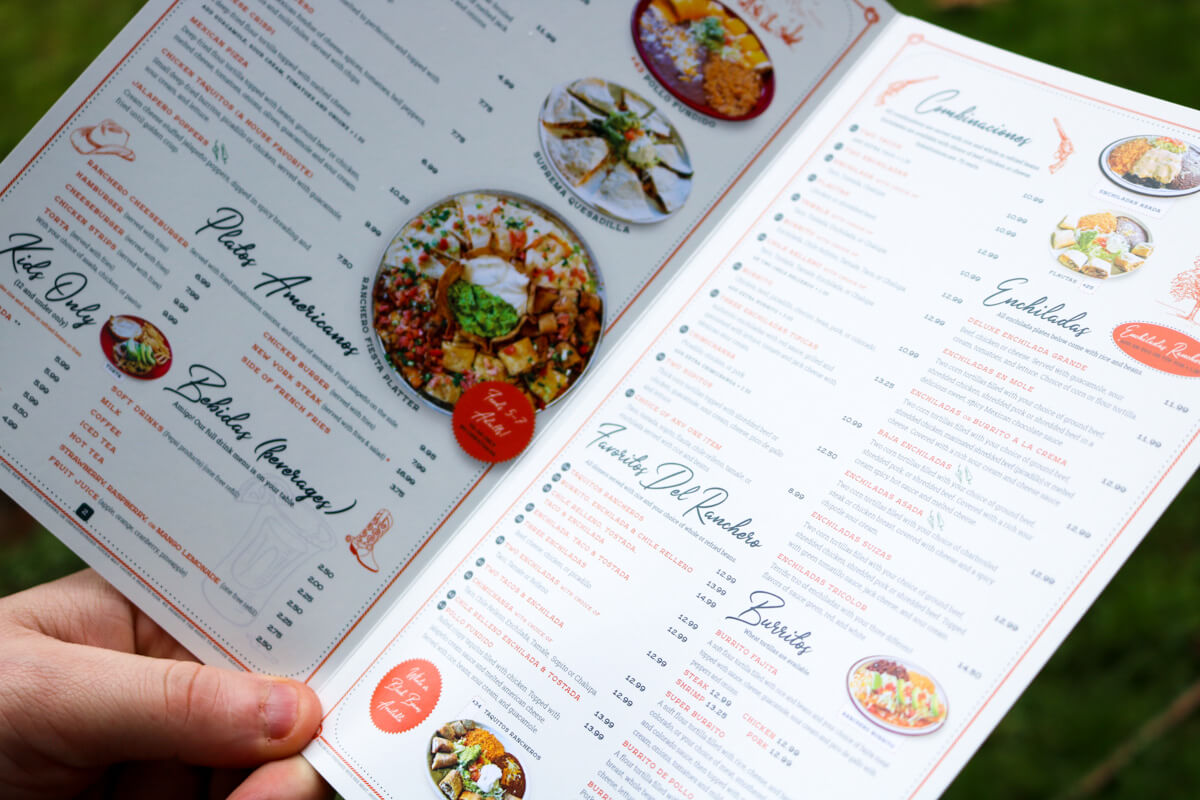
We were there to talk about a website.
But, when we first sat down and spoke with El Ranchero in Longview, Washington, it was clear their existing menu wasn’t going to cut it. They were also looking for someone to design a new one. We offered to help, and here we are!
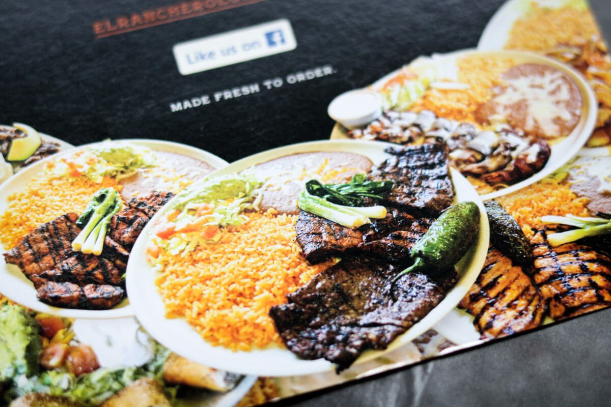
When it comes to a local restaurant, it can be easy to slap together the menu and call it a day. That’s not how we operate with any of our projects. Personally, I have never been one to skip over details, or cut corners for the sake of completing something quicker. Whether that is a project at home or graphic design, it’s just not in my DNA. Plus, you’re going to pay for it eventually. You might as well take the time to do it right in the first place.
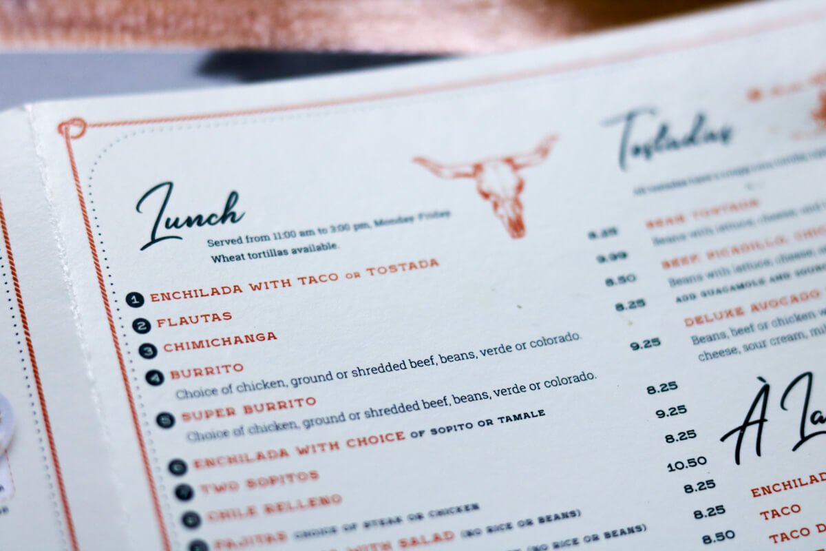
The first thing you’ll notice is that there are a lot of options on the menu. It was important that we displayed everything in an organized manner.
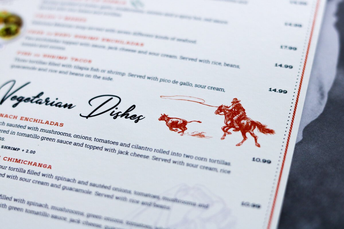
When you’re working with a lot of items in a design, it’s important to have consistency. That way people can easily scan and find what they are looking for. Think about a book. If each page had a different sized font or typeface and varying colors, you might be reading a children’s book. But really, any decently produced book will have great design consistency. The design needs to be invisible in a sense, so it doesn’t distract the reader.
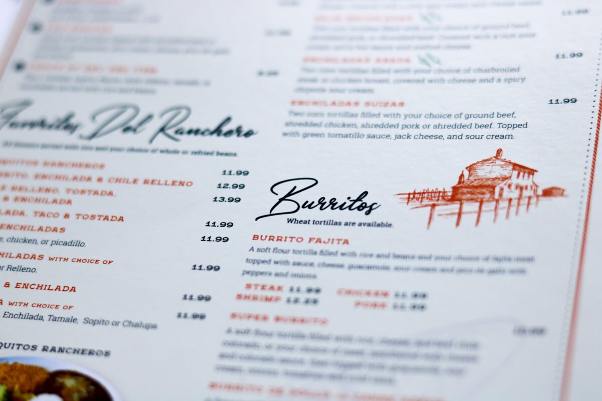
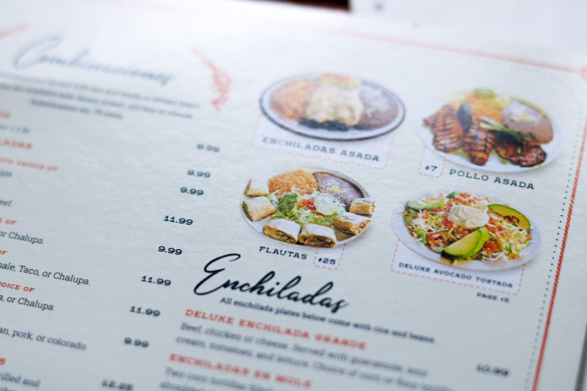
You’ll notice that there’s a clear hierarchy in the design with the categories available in the larger typeface.
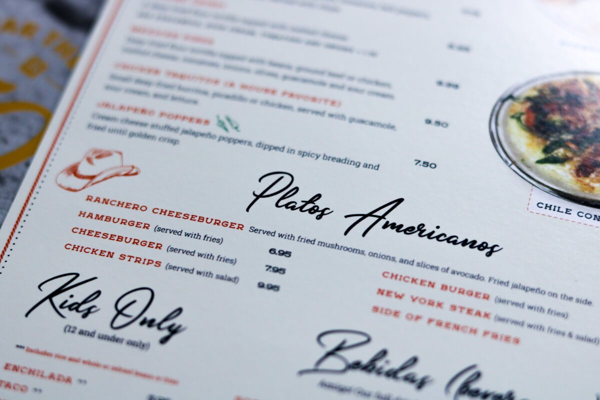
All the menu options also have the same styling and font size throughout.
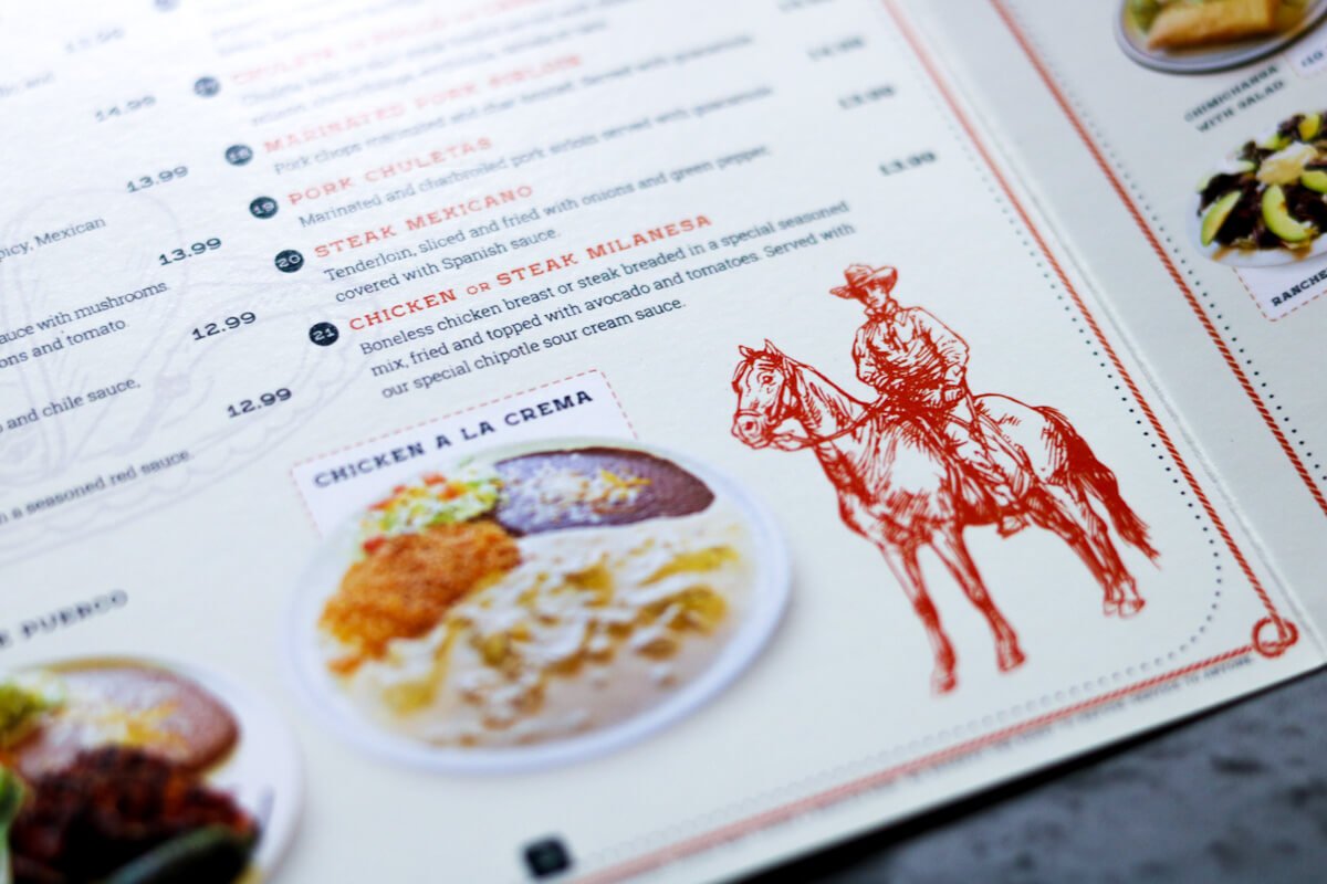
At El Ranchero, there is a lot of personality outside the restaurant and inside. We wanted to add that same personality in the menu with illustrations throughout. You’ll also notice a lot of details like background graphics and borders.
On the front cover, we wanted to make sure it had all the relevant information for the restaurant right off the bat. Items like hours of operation, phone number, address, website address, and, letting customers know that they are on Facebook and Instagram.
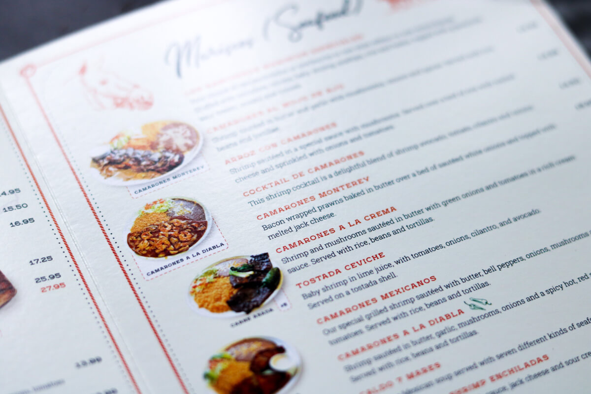
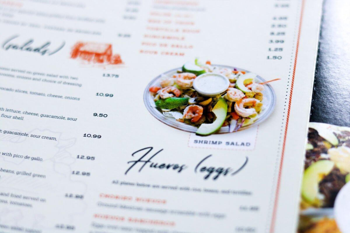
Everyone agreed that having photos of the most popular dishes would be a good idea. After all, what’s going to make you hungrier? A description of food or a photo of it? Luckily, all the food that El Ranchero provides not only tastes amazing but also looks amazing.
After we finished the main menu design, we then started on the takeout menu design.
The takeout menu design is the exact same menu but formatted in a way that makes sense as a trifold brochure. This allows their customers to take the exact same menu home with them. That way they always know where their favorite dishes are located. Plus, if you pick this menu up at home, you’ll be hard-pressed not to give El Ranchero a phone call for takeout.
After we were finished with both menus, we also printed them.
Since we originally designed their menus, we have helped them with other menus. We’ve designed a drink menu that sits on every table in the restaurant and a happy hour menu. We’ve also updated their primary menu and takeout menu three other times and have supplied them with the printing every time.
Do You Need a New Menu Designed?
What is your menu say to your customers? Does it look like an afterthought and in no way represent the quality of food you provide?
We don’t have to start from scratch. We can work with your existing menu to take it to the next level.


