
I’m going to change things up with this post by showing you examples of nice restaurant websites in Seattle, Washington.
I’m going to share my feedback on each website and why I think it’s a good example. I’ll also share things that can be improved.
In the end, the goal is to allow you to see examples of other restaurant websites and to understand why each one works well.
Let’s jump in!
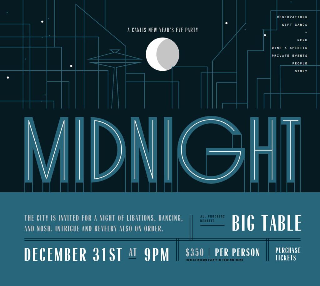
Canlis in Seattle, Washington
This website has a ton of character. You’ll remember it. That’s what you want your restaurant to do, stand out and be memorable online.
Many restaurant websites will have something bare bones. They might add a menu, contact information, and a photo. Most people would say, this is better than nothing. But if you really want to take advantage of the power of the internet, really connecting with your prospective customers online will go a lot further than a generic cookie-cutter website that blends into the crowd. By the way, this advice applies to any facet of marketing!
Now, this website does have a modern look with a unique layout. This may confuse an older audience or people who are less tech-savvy. The navigation for the website is at the top-right of the screen, but it doesn’t look like a menu. Plus, the address and phone number can’t be found unless you scroll to the bottom of the website. This doesn’t mean that these qualities are bad for the website. It really just depends on your target audience. Just make sure you think these things through and have a good rationale for choices like these. In the case that a restaurant is extremely well known in the area, having general information like this may not be as important as focusing on events, environment, and atmosphere.

Wind City Pie in Seattle, Washington
Like the Canlis example, this website also makes a statement. It’s bold yet at the same time, simple.
The navigation at the top-right of the screen is clear and contains the most important information. It includes the menu, about, ordering and also social media links, including links to Foursquare, Trip Advisor, and Yelp (the most common places people will visit for reviews). If you scroll down, you’re immediately shown the hours and location information. They also include parking information which can be extremely helpful for first-time visitors.
Where this website could improve is by showing images of the actual restaurant (inside and out) so people can get a good overall impression. There’s actually no images of the restaurant that I could find on the website. I’m assuming they think people will go to their social channels and find that information. That may be true, but you really don’t want to rely on social media to provide more information. The last thing you want to do is have your prospective customer jump onto Facebook, see their notifications, click and get lost in the ether. Thirty minutes later… What was I doing? Not good for business.

Salare in Seattle, Washington
This website is intentionally simple. What makes it nice is that they show an inside photo of the restaurant, which looks very pleasant.
The navigation is clear, featuring what you want to see: about the restaurant, menu, gallery, and reservations.
On the about page, they show photos of their staff and information about them including fun facts. This is one thing where a lot of websites fall short: making a human connection with the visitor. After reading the About page, you feel like you’ve got a chance to know the staff and now see the place as a friendly small business. A stark contrast where you may think the restaurant hostess shouts “next!” only to serve more dishes to faceless people.
The Gallery includes a video walkthrough of the restaurant which is excellent. It’s the closest thing you’ll get to actually going there. When you get to Salare, you’ll know exactly what you’re signing up for. No surprises.
On their reservations page, you can make a reservation online (through OpenTable) and they also provide you with all the contact information you’ll need to know, including directions. The only improvement to this page would be renaming the page since it contains a whole lot more information than just reservations. I think the website could use a bit more personality (like their video), but other than that, this is a solid website.

Un Bien in Seattle, Washington
This is a one-page website that’s done well. As you scroll down the page, you go through the menu and information about the restaurant. The menu is also well organized by different topics so you can easily find the dish that you’re looking for. They also provide links to Yelp, Facebook, and Trip Advisor (again, because people want to validate the restaurant on those networks).
One item that could be improved is having the navigation viewable when initially landing on the page. Right now, it doesn’t appear until you scroll down the page. Most will see the menu, but some won’t. I would also like to see more pictures of the restaurant itself and staff to get a more holistic impression.
Wrapping It Up
The point of this post is to show you examples of great restaurant websites that stand out from the crowd in one way or another. You don’t have to lower the bar for your restaurant’s website just because your competitors don’t have a website or have one that’s mediocre. It’s only a matter of time before they do start focusing on their website and you want to be ready when that time comes.
Some may also argue that they don’t need a website at all. But you have to remember, Yelp, Trip Advisor and Facebook are their own playgrounds. A place the bad-review-troll will stop by eventually. You can control certain aspects of those channels, but in the end, it’s not yours. It’s a third-party service. And as popular as they are today, it’s only a matter of time before they don’t exist.
Want to Learn About Our Restaurant Web Design Service?
You can read about our custom web design and development service here.
You can call or text us (360) 450-3711, too. Always happy to help.
Thanks for reading!


