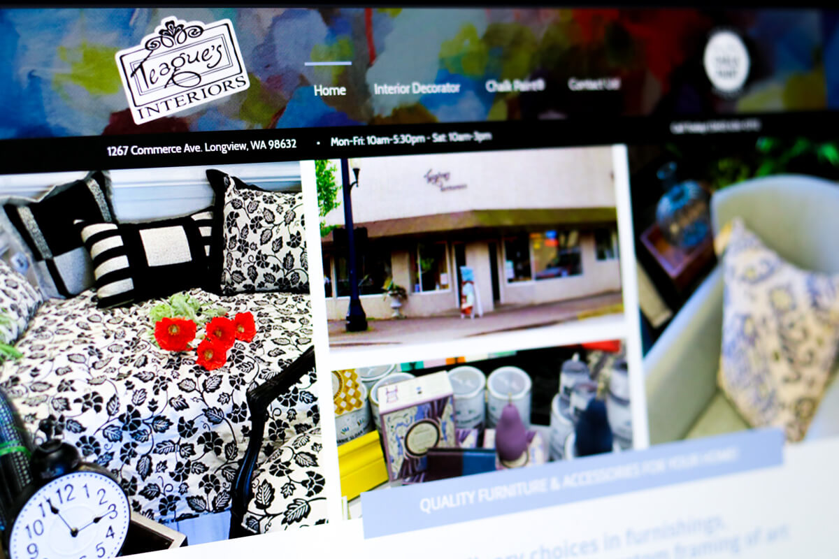
Today, I would like to look at a retail web design for a local business called Teague’s Interiors here in Longview, Washington.
You can watch the video above, and I will also go into the details below.

When Teague’s Interiors contacted us, they were looking for brand-new website rather an improvement to their existing website. The note wasn’t doing a lot for their business and needed to be improved. They asked us to review the website and offer our suggestions.
In case you’re not aware, we offer free 35-point website review for anyone that asks. Get your free web design review today: www.graticle.com/freewebsitereview

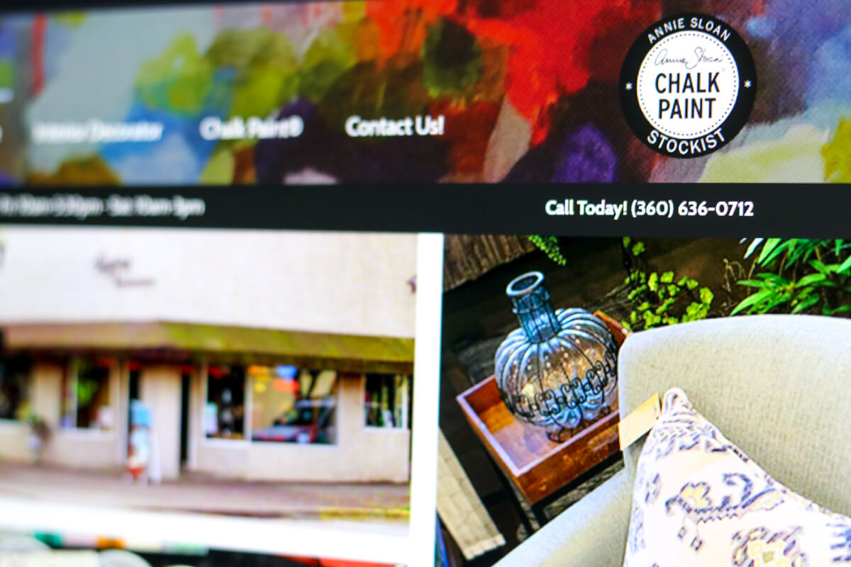
One of the primary suggestions we made, was having contact information readily available for visitors on every page. At a minimum, they needed to have the phone number at the top-right corner of the screen. This is especially important for retail establishments since visitors will eventually come to your store. You can never assume the visitors will find your address and contact information in your footer or on your contact page. You have to be redundant and easy for your visitors to find.

Another suggestion or the photo selection in the hero area on the homepage. They had a large photo of their building in a couple of outdated photos. The building photo was okay, since it is a recognizable landmark downtown, but there needed to be more enticing and up-to-date images included. I don’t believe they had updated these images in a few years. That brings up another point. You must continually look at your website. Read through the content at minimum once per quarter. Look through your photos and make sure everything still is reflective of your current business. A lot of businesses will simply ignore their website. Like an ostrich, the put their head in the sand and assume the rest of the world is doing the same. Rest assured, people are looking at your website just like the driving by your business. You better make sure everything is presentable and accurate.

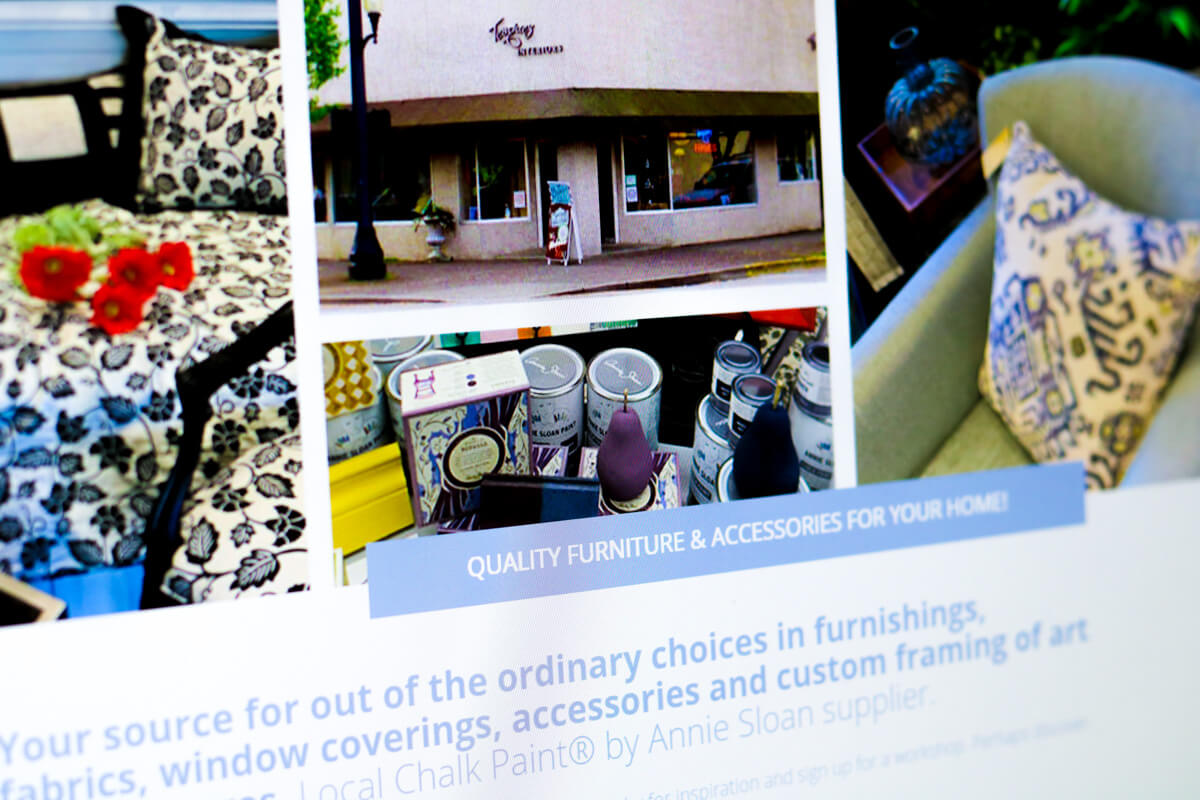
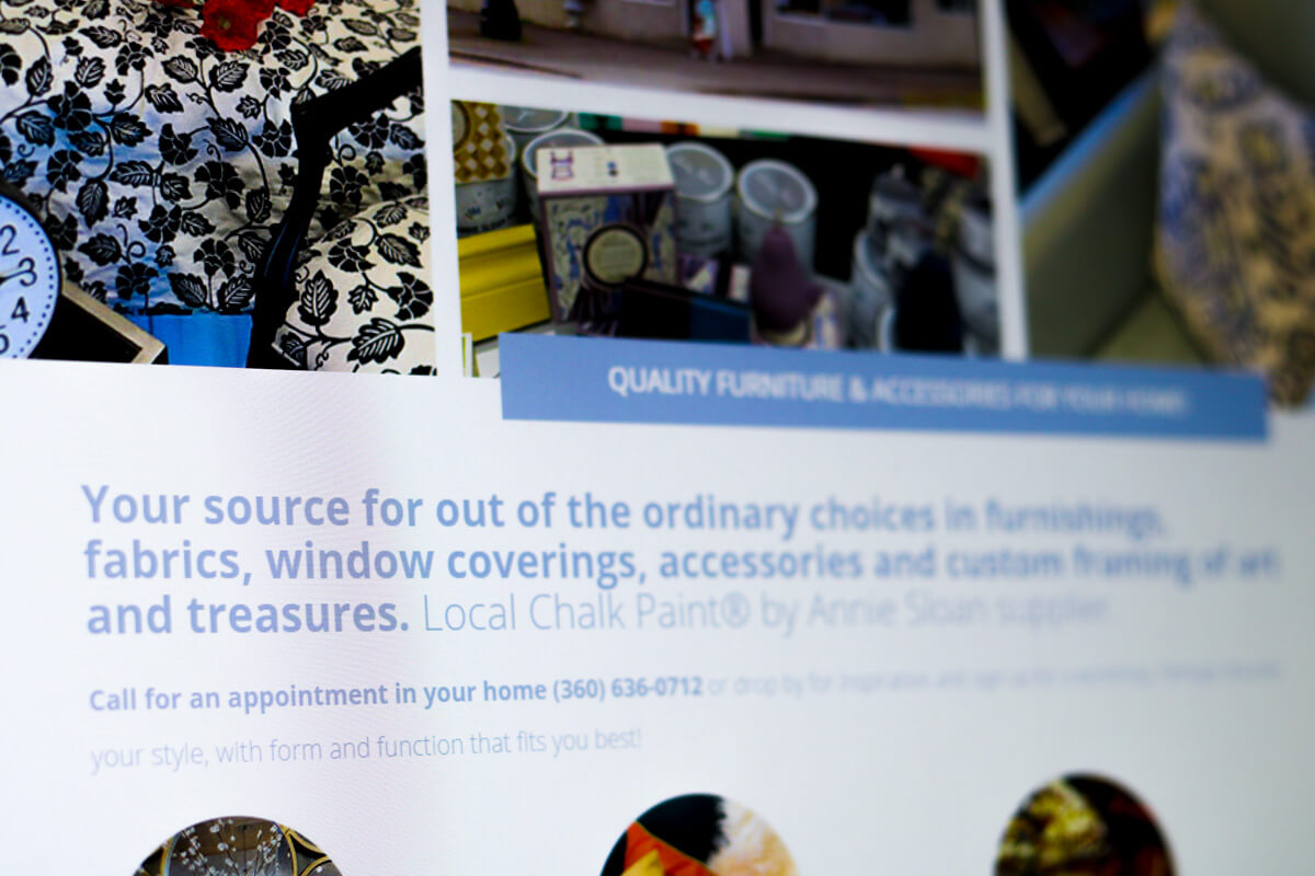
Something else we noticed was that there was no summary of what the business did or a call to action. The visitor was left to do all the work themselves to try to find this information. On the homepage, we added this summary in large type including a call to action right below it, asking for visitors to call them today. It’s not enough to just simply list your contact information. You have to give people a reason to contact your business. Are you offering something free? Maybe you have a time sensitive offer? Whatever the case, you need to give people a reason to contact you right now and not put it off. Otherwise, people get distracted and move on to other things. From a business perspective, you don’t need them to exchange money with you immediately. You simply need an opportunity. That can be as simple as building your email newsletter list to stay in contact (market) with your visitors. If people are going your website and leaving without taking any kind of action, your websites not going to be effective for your business.
Are you looking for a retail web designer?
We love to help you. I recommend you start with our free 35-point website review which you can get here today: www.graticle.com/freewebsitereview
We’ll make sure your website is up-to-speed and following best practices. We’ll also include a video walk-through of your report and tips and tricks on how your website can be improved. All for free.
Looking forward to helping you.


