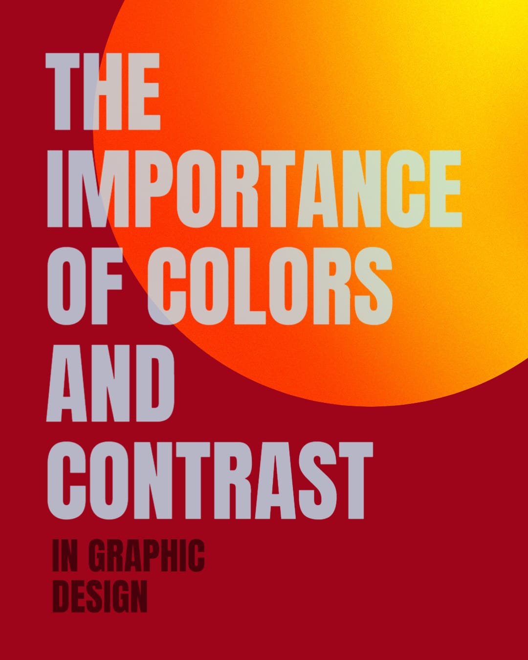
If you’re a graphic designer, then you know how important color and contrast are in your work. They can make or break a design, and it’s essential to use them correctly in order to create an effective graphic. In this blog post, we’ll discuss the importance of colors and contrast in graphic design, and we’ll give you some tips on how to use them effectively. So if you’re ready to learn more about this important topic, keep reading!
Why are colors and contrast important in graphic design?
Colors and contrast are important in graphic design because they can help to make your graphic more eye-catching and easy to read. By using light and dark colors together, you can create a dramatic effect that will grab attention. And by using different shapes, sizes, and colors of text, you can make sure that your graphic is easy to read and understand.
Using colors
One of the most important aspects of graphic design is choosing the right colors. Colors can set the mood for a design, and they can also influence how people perceive it. For example, warm colors like red and orange are often associated with energy and excitement, while cool colors like blue and green are usually associated with peace and relaxation. It’s important to choose colors that will complement the message you’re trying to convey with your graphic.
Using contrast
In addition to choosing the right colors, it’s also important to create contrast in your design. Contrast is what makes elements stand out from each other, and it’s an essential tool for creating an effective graphic. Without contrast, everything would blend and be difficult to read. There are a few ways to create contrast in your design, but one of the most important is to use light and dark colors together. This contrast can make your graphic more eye-catching and easy to read.
Now, let’s dive in and take a closer look at each of these important elements!
Color Psychology
When it comes to colors, graphic designers have to think about more than just what looks nice together. They also have to think about the psychology of color. Different colors can evoke different emotions in people, and it’s important to choose colors that will convey the right message. For example, if you’re designing a graphic for a child’s birthday party, you might want to use bright, cheerful colors like yellow and pink. But if you’re designing a graphic for a funeral, you’ll probably want to use more subdued colors like black and white.
Color theory is a complex topic, but there are a few basic principles that all designers should know.

The color wheel
The color wheel is a way of organizing colors that shows how they relate to each other. It’s a helpful tool for graphic designers because it can help you choose colors that complement each other. For example, if you want to create a graphic with a warm feeling, you might choose colors that are next to each other on the color wheel, like red and orange. Or if you want to create a graphic with a cool feeling, you might choose colors on opposite sides of the color wheel, like blue and green.
There are three different types of colors on the color wheel: primary, secondary, and tertiary.
Primary colors
Primary colors are the basic colors that can’t be created by mixing other colors. They’re the colors that are at the center of the color wheel: red, yellow, and blue.
Secondary colors
Secondary colors are created by mixing two primary colors. They’re located between the primary colors on the color wheel: orange (red + yellow), green (blue + yellow), and purple (blue + red).
Tertiary colors
Tertiary colors are created by mixing a primary color and a secondary color. They’re located between the primary and secondary colors on the color wheel: yellow-orange, red-orange, red-purple, blue-purple, blue-green, and yellow-green.
There are also three different types of color schemes that you can use in your designs:
Monochromatic:
This scheme uses different shades of the same color. For example, you could use light blue, dark blue, and navy blue.
Analogous:
This scheme uses colors that are next to each other on the color wheel. For example, you could use yellow, yellow-orange, and orange.

Complementary:
This scheme uses colors that are on opposite sides of the color wheel. For example, you could use blue and yellow.

Contrast
Now that we’ve talked about colors, let’s move on to contrast. Contrast is what makes elements in a design stand out from each other, and it’s an important tool for creating an effective graphic. Without contrast, everything would blend and be difficult to read. There are a few ways to create contrast in your design, let’s get go over a few:
Contrast with color: To create contrast with colors, you can use light and dark colors together. For example, you could use a light blue background with dark blue text.
- Temperature: You can also create contrast by using warm and cool colors. Warm colors are typically red, orange, and yellow, while cool colors are typically blue, green, and purple.
- Saturation: Saturation is the intensity of a color. You can create contrast by using both bright, saturated colors and muted, desaturated colors.
- Value: Value is the lightness or darkness of a color. You can create contrast by using both light and dark colors.

Contrast with shapes:
You can also create contrast by using different shapes in your design. For example, you could use circles and squares together.
- Geometric shapes: Geometric shapes are shapes with clean, straight lines. They’re typically used to create contrast with more organic, flowing shapes.
- Organic shapes: Organic shapes are shapes that are based on natural forms. They’re typically used to create contrast with geometric shapes.
Contrast with sizes:
You can also create contrast by using different sizes in your design. For example, you could use large text and small images.
Contrast with textures:
You can also create contrast by using different textures in your design. For example, you could use a rough texture for the background and a smooth texture for the text.
Contrast with typography:
You can also create contrast by using different fonts in your design. For example, you could use a sans-serif font for the body text and a serif font for the headlines.
- Sans-serif: Sans-serif fonts are fonts without the small lines at the end of each letter (these are called serifs). They’re typically used for body text because they’re easy to read.
- Serif: Serif fonts are fonts with the small lines at the end of each letter (these are called serifs). They’re typically used for headlines because they’re easy to read.
Contrast with whitespace:
Finally, you can create contrast by using whitespace in your design. Whitespace is the empty space between elements in a design. By adding more or less whitespace, you can make elements stand out or blend together.

Choosing Colors for Your Design
Now that you know a little bit more about colors and contrast, let’s talk about how to choose colors for your design. There are a few things to keep in mind when choosing colors:
The message you want to communicate:
Colors can be used to convey different messages. For example, blue is often used to represent calmness and serenity, while red is often used to represent energy and excitement.
The mood you want to create:
Colors can also be used to create different moods. For example, warm colors like red and yellow are often used to create an energetic or exciting mood, while cool colors like blue and green are often used to create a calm or serene mood.
The audience you’re targeting:
Colors can also be used to appeal to different audiences. For example, bright colors are often used to appeal to children, while muted colors are often used to appeal to adults.
The culture you’re targeting:
Colors can also be used to appeal to different cultures. For example, red is often used to represent luck in China, while white is often used to represent purity in India.
Parting advice
Colors are a powerful tool that can be used to convey different messages, create different moods, and appeal to different audiences. When choosing colors for your design, it’s important to keep all of these factors in mind. With a little bit of thought and experimentation, you can use colors to create a design that’s both visually appealing and effective.