In this web design spotlight, we’re going to cover the website we designed and developed for Home Water Plant in Seattle, Washington.
Originally, when the customer contacted us they had a revolutionary product that they wanted to bring to market. The challenge was, that every person involved in building this product was extremely technical. When they first showed us the product, they slid a binder across the table. If you wanted to know exactly how this product worked scientifically, you could dig in to this information and understand it completely. The problem is, no one is going to spend any real amount of time reading through a binder like this. If they handed this binder to a prospective customer, the customer would toss it in the trash. On a positive note, we had a solid base to work from. It’s much better to start with too much than not enough.
Our job was to simplify this product and brand itself, and we started with the logo. We will cover the logo and branding project in another post.
For now, back to the website!
It’s great this product removes all the unnecessary things you don’t need in your water. But leading with this information isn’t a good idea. It would put your prospective customers to sleep. What we needed to do, was simplify the product and make it easier to take in for people.
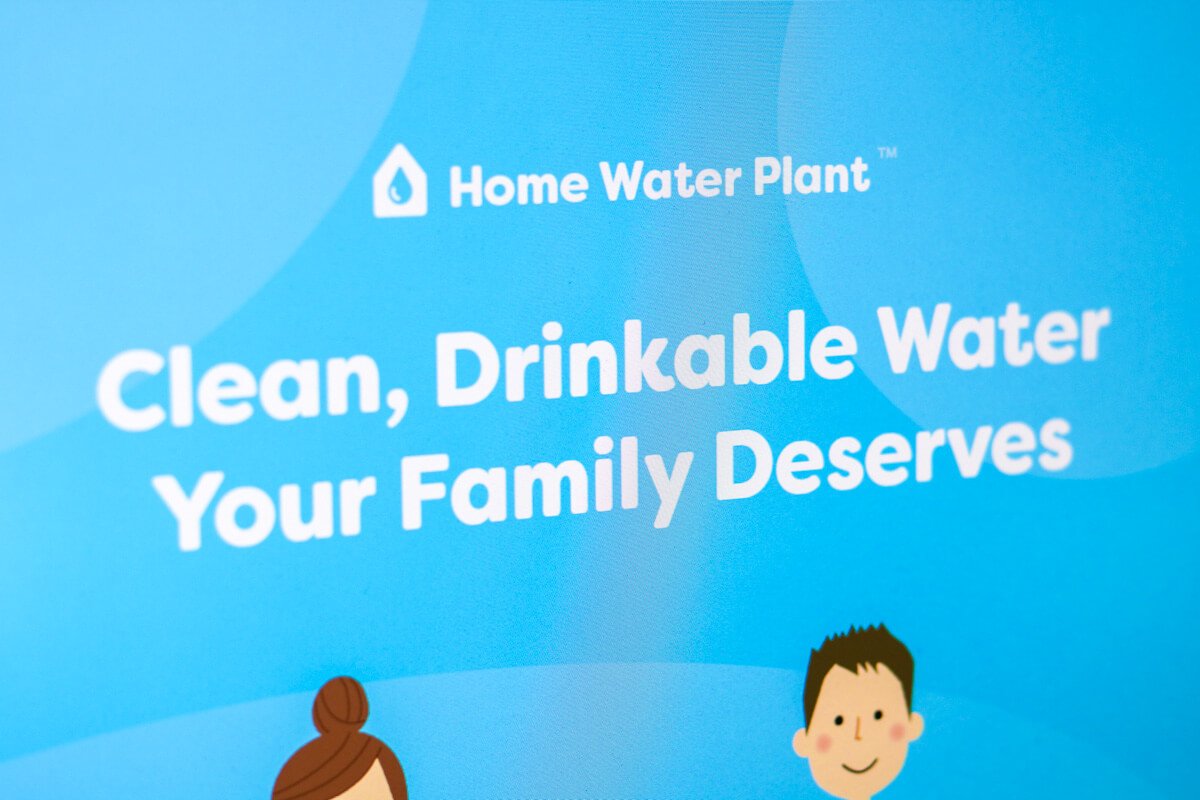
As you can see on the website, the headline “clean, drinkable water for the whole family” is easy to understand. The sub line below it further solidifies this. After you read those two lines, it’s clear what this product does and what it can do for your family. If you’re looking for clean, clear, drinkable water then you’re in the right place.

I mentioned all the complexities of this product. To the consumer, none of this matters. They know they have bad water, and they want it fixed. Everything else is details.

Now, instead of going into those technical details of how the product works, we decided on five primary benefits that the Home Water Plant provides. We showcase these right below the main hero image on the website. It’s very important to have everything easy to digest for visitors. Everyone on the Internet is moving fast, and has little, if any, attention span. It’s important to allow someone to scan headlines and read more if they are interested. Grab your favorite novel and open it to a random page. That’s exactly what we don’t want to emulate.
On the homepage, we have addressed the concerns of the consumer in a story type format. First, allowing them to understand what the product can do for them. Then, the benefits of the product itself.

Next, we talk about what their current contains and is doing for them. The current water out of the faucet puts water spots on their dishes. The water stains dishes and might even dry out your skin.

Lastly, we showed the product itself and the various components. Instead of going into the details on each component, there are links to each phase where the reader can learn more if they choose. Otherwise, they can keep scrolling. Again, you have to show enough to keep the visitor interested, but not so much that they lose interest. For those that are interested in something specific, they click and dive in.

Calls to Action are Crucial
You’ll see the phone number at the top-right of the screen on every page asking for people to call.

At the bottom of every page, there is a call to action asking for the customer to make a phone call, email, or even fill out a quick consultation form. This allows the visitor a variety of methods to contact the business. They can choose what’s most convenient and to take the next step.

Schedule a Free Phone Consultation
This form allows busy visitors to be able to fill out their information and get a call back. The visitor only has to leave their contact information without writing a message. This is for people who are interested and want more information but are not ready to commit. This makes it easy for the visitor, because they fill out a few fields and go about their day. For the company, they get a conversion and a lead that they can follow up on. The important thing to note here is that it’s simple for everybody.
Simplified Navigation
You’ll notice that the top of every page the navigation is simple. There are four primary links and two secondary links, including a phone number. There’s also a hamburger menu where extra pages are stored. These were determined to be of less importance and allowed us to simplify the navigation so that people can find the most requested information such as the frequently asked questions page, technical info, or contact.

Hamburger Menu
Again, this allowed us to simple father navigation by placing extra pages here that weren’t a high priority.

Request a Quote
If someone wants to get an accurate quote (without making a phone call) they can go to the Request a Quote page. This is an easy-to-use page where the visitor can fill other information and get a quote back within two business days.

Technical Information
It was important to have an area on the website where people could read all the technical details on how the product worked. After all, anyone can say they can filter water, but what does that mean exactly? All the documents here on this page allow someone to compare apples to apples as they are looking at various water filtration companies.

Have a Question?
You’ll notice on various pages there is the phone number and email address listed. This is important because if someone does land on a page, and they do have a question, contact information is easy to find. This increases conversions and helps the trust level of visitors knowing that this company is a phone call or email away. Having contact information hidden would make this website much less effective.

Frequently Asked Questions
We designed this page to make it simple for someone to find the question that they’re looking for. Rather than navigating through all the questions and answers, someone simply navigates through the questions to find their answer, and then clicks to view the answer. Simple.

Contact Us
On this page, not only was it important for customers be able to send their information through a contact form, but we also wanted to allow customers to find their answers (self-serve). If someone has landed here, and hasn’t seen the resources or frequently asked questions pages, then there are links on this page to help them.
If someone does choose to fill out the form, they are also asked if they are a homeowner or a plumber/contractor/dealer. This allows the company to be able to filter things on their end to better support the customer depending on their needs.

Blog
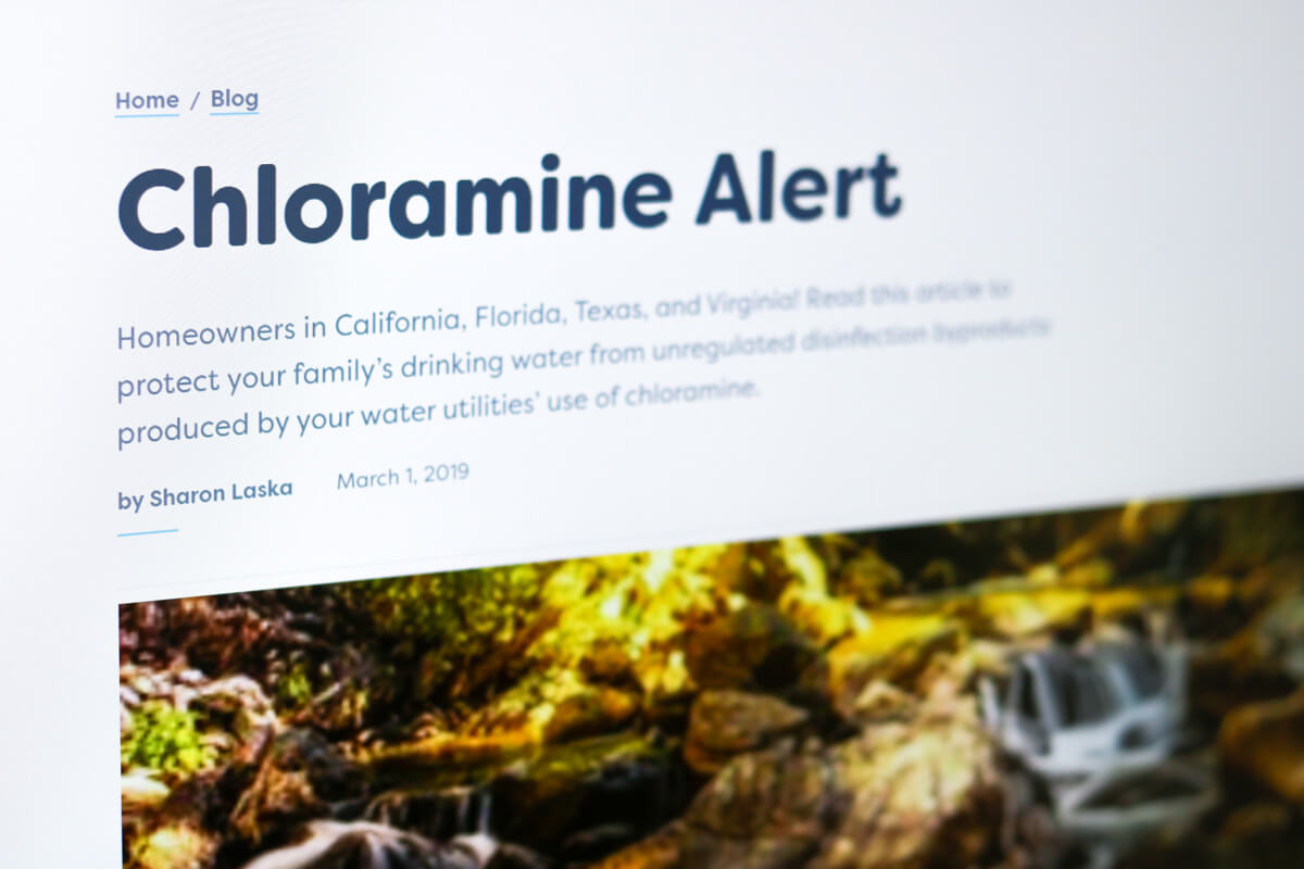
On the blog (and throughout the entire website) it was very important that it be readable and easy to use. You’ll see that the font choice is larger and the design is straightforward with limited distractions. This allows visitors to stay focused on the content.
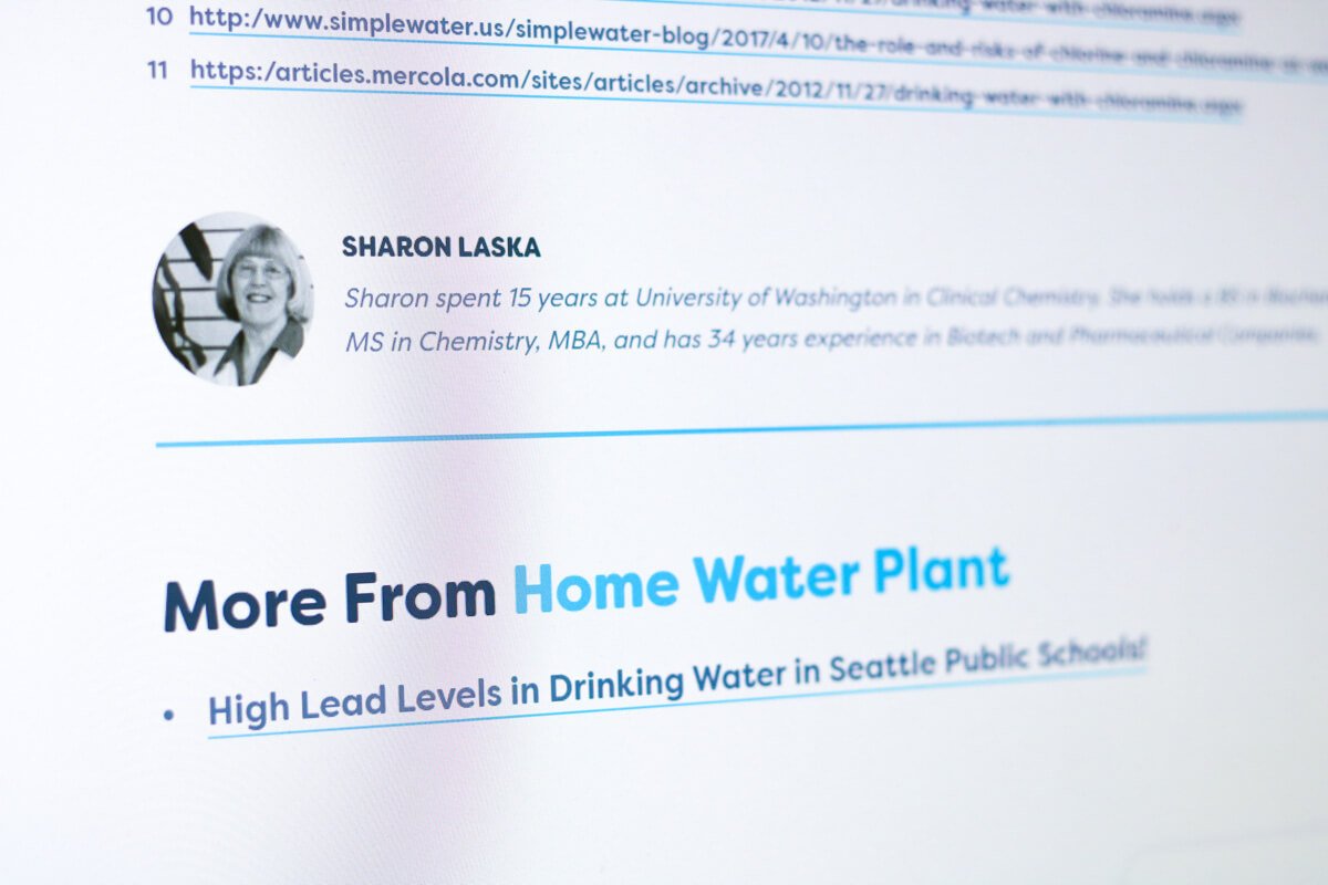
You’ll also notice the byline for each blog post. This is critical, because the people behind this company are extremely experienced and credible. This is a great place to add their bio so visitors know that they are reading content from a qualified expert.

Need Web Design Services?
I hope you enjoyed this web design spotlight. If you have a water filtration company and need help designing your website or brand, please Call or Text (360) 450-3711 or Request a Quote.
Looking forward to helping you.


