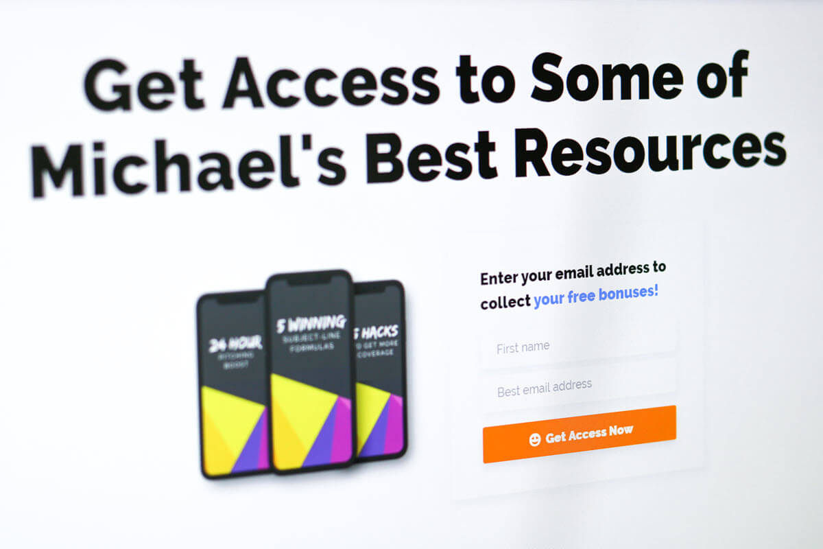
In today’s web design spotlight, were going to review a website that we designed and developed for Michael Smart PR, a well-known PR consultant. We also updated his logo/brand, but we will save that for another day.
We had been hosting, maintaining, securing, and adding features and functionality to Michael Smart’s previous website for the past couple of years. When he asked us to create a new website for his business, we jumped at the chance. His previous website had worked for what he needed, but a lot had changed in his business (not to mention, online technology), and so having a new website made the most sense to better leverage his online presence.
Here’s a screenshot of what his website looked like before:

And here is a shot of the website we created for him:

You’ll see with the new website, we wanted to make it clear and straight to the point when someone landed on the website. What is the offer and how does it add value to the visitor’s life?
It’s also important that we have a call to action right out of the gate. The primary call to action is the lead magnet with Michael’s subject line formulas and weekly free PR tips in exchange for the visitors first name and email address.

The first impression is warm, friendly, and inviting. Exactly the type of environment that Michael provides at his seminars and throughout his online training courses. We wanted to make sure that came across right out of the gate.

A secondary call to action, is the free resources link in the header.
You will also notice that the navigation is simplified. This allows people to easily find what they are looking for and not feel overwhelmed with a multitude of choices.

Immediately after you scroll down you’ll also see the companies where Michael has helped his students get coverage. This helps build authority in the visitors eyes. Visitors will also see that Michael helps people get coverage in big places. In short, he’s the real deal.

After that, you’ll be greeted with an excellent overview video giving you a chance to see how Michael can help you in a video format. Videos like this really help conversions since visitors can get a holistic picture of the value Michael offers.

The primary product that Michael is selling on his website is his Inner Circle. So after the video, there is a brief overview of what is included in the inner circle.

After that, social proof (testimonials) from Michael’s students. You’ll notice there are a couple of call-to-action buttons sprinkled throughout. You can never be too redundant with calls to action, and you can almost never ask someone to take the next step soon enough on a website.

The most valuable part of Michael’s website is his Smart PR Inner Circle. This is where Michael keeps all his premium content for his PR paying students.

Our goal was to make this as easy to use for students as possible. Once you are logged in, you’ll notice at the top there is a secondary navigation bar that let you know that you are logged in. It also includes all the links to the various premium areas on the website. This provides the visitor with a dashboard of sorts. It helps the experience feel more valuable and allows you to know this entire area is off limits for those that do not pay, which adds even more value to everything inside the Inner Circle.


You will also notice there are a variety of landing pages and unique page layouts throughout the website.
Are you a consultant that needs web design help?
Call or text us (360) 450-3711 or Request a Quote. Looking forward to helping you.


