
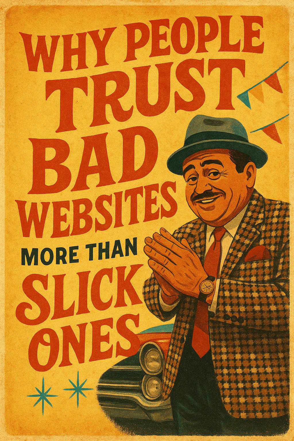
The paradox you’ve noticed but rarely say out loud
We’ve all had the experience: you land on a site that looks like it hasn’t been touched since the flip-phone era, and somehow you still believe the company behind it. Then you visit a highly polished website loaded with motion, gradients, and stock-photo smiles, and your guard goes up. It’s a strange reaction on the surface. Shouldn’t sharper design equal higher trust?
Not always. People don’t evaluate websites the way designers evaluate portfolios. They evaluate signals—subtle cues that tell them whether a business is honest, competent, and safe to contact. A “bad” website sometimes emits the right signals by accident: plain language, obvious intent, and the sense that a real human wrote the copy. Meanwhile, a slick site can bury those signals under layers of production value. The result: the rough site feels earnest; the glossy site feels rehearsed.
This article breaks down why that happens and how to keep the benefits of a professional build without triggering the “too polished to be real” alarm. If you run a local business, lead a B2B team, or you’re simply tired of guessing what makes visitors trust you, you’ll leave with a checklist you can act on this week.
What visitors actually look for (but never articulate)
Visitors don’t arrive with a grading rubric. They arrive with a job to do: confirm they’re in the right place, gauge risk, and predict what will happen if they click the button or pick up the phone. During those first seconds, five questions dominate the decision:
- “Is this the right kind of business?” Category clarity beats cleverness every time.
- “Do they serve people like me?” Proximity, specialization, and relevance matter more than broad claims.
- “How much hassle am I signing up for?” People fear wasted time more than they fear price.
- “Will they respect me?” Tone, transparency, and responsiveness signal respect.
- “What happens next?” Clear steps lower cortisol and raise conversion.
A site can be visually plain and still nail all five. A site can be visually stunning and dodge all five. Trust follows the signals, not the sheen.
The psychology that makes “rough” feel real
Processing fluency and the honesty bump
Humans prefer information that’s easy to process. Simple layouts, straightforward headlines, and familiar patterns reduce cognitive load. Paradoxically, many “slick” designs introduce friction: novel navigation, dense hero animations, and decorative language that says little. When visitors have to think too hard, their brain interprets that effort as a sign that something might be off. Plain design—what some would call “bad”—can feel more credible because it’s easy to parse.
Signaling theory in plain view
People use inexpensive but reliable signals to judge intent: local photos, specific service areas, real names, and phone numbers that ring during business hours. Overly polished sites often lean on expensive but unreliable signals: cinematic stock footage and sweeping claims. Visitors can’t verify those. They can verify a photo of your team outside a recognizable building, a calendar with real availability, or a short video filmed in your shop. Verification beats varnish.
Reactance: when the pitch gets too pushy
Push too hard and people push back. Aggressive popups, auto-play videos, countdown timers—these tactics promise urgency but trigger reactance. A “bad” site rarely implements these. By accident, it shows restraint. That restraint is read as confidence: “We’re here when you’re ready.” Confidence earns trust; pressure erodes it.
The uncanny valley of marketing
When copy sounds human, we lean in. When it sounds like it was optimized to death, we pull back. There’s a valley where the message seems almost human but polished beyond recognition. Visitors suspect spin. A rough headline written by the owner—typo corrected, clarity preserved—can feel more trustworthy than a committee-crafted slogan that could belong to any brand.
How slick design can accidentally hide trust cues
Over-curated language
Vague promises—“innovative solutions,” “driving success,” “world-class service”—look professional but say nothing. People want nouns and verbs they can picture: “We install and repair commercial ice machines across Cowlitz County. Same-day service when possible.” Specificity is a truth signal.
Stock visuals that flatten reality
The more generic the imagery, the less anyone believes it. Even a decent phone photo of your crew on a real job site can outperform a perfect stock shot. Real pictures carry imperfections—mismatched jackets, a cloudy sky—that prove context. That proof is trust.
Motion used as makeup
Animation can clarify how something works; it can also distract from thin content. If motion hides the lack of substance, people sense it. If motion reveals steps, timelines, or before-and-after results, people appreciate it.
Navigation that hides the obvious
Clever labels and nested menus delay answers. The most trusted sites keep the essentials one click away: services, pricing signals, service area, proof of work, and ways to start. If a visitor needs to hunt, trust drops with each click.
What “bad” sites accidentally get right
- They speak plainly. Owner-written copy often uses the terms customers use.
- They show real work. Photos may be imperfect, but they’re believable.
- They expose the phone number. No chat funnels before contact.
- They keep choices simple. Fewer pages, fewer clicks, less confusion.
- They avoid trendy dark patterns. No guilt-trip popups or fake scarcity.
None of this argues for sloppy execution. It argues for prioritizing signals that matter before layering on style. The goal isn’t to look worse; it’s to avoid sanding off everything that feels true.
Keep the polish, keep the trust: a practical framework
You can have a fast, modern site that still feels human and trustworthy. Use this framework during planning, content, and QA.
1) Say the boring thing first
The headline should state the category and the promise without word games:
- “Commercial Kitchen Equipment Sales & Service in Longview, WA”
- “Custom WordPress Websites for Pacific Northwest Businesses”
- “Residential Roof Repair and Replacement in Kelso & Woodland”
Follow with a single sentence that anchors your edge: speed, specialization, or service model. Don’t stack three claims; pick one and prove it.
2) Replace abstractions with proof
- Show two real case snippets with the outcome in plain numbers or quotes.
- Include one “messy middle” photo—the during shot—so the after looks earned.
- Use names (with permission), locations, and dates. Specifics are verifiable.
3) Publish the path, not just the pitch
A short “Here’s how this works” section lowers risk. Three to five steps, each with one expectation:
- Step 1: Quick call (10–15 minutes). We confirm scope and timeline.
- Step 2: Site visit or screenshare. We gather photos or logins.
- Step 3: Written estimate with options by the next business day.
- Step 4: Work scheduled. You get a named point of contact.
- Step 5: Final walkthrough and warranty details in writing.
4) Show prices like a pro
If you can’t list fixed prices, list price anchors: typical ranges, common add-ons, and what changes the number. Ambiguity invites suspicion; ranges show respect.
5) Make contact feel safe
- Offer two routes: a short form and a phone number that’s staffed.
- Explain response time and what to include in the message.
- Promise no spam and honor it. One follow-up is polite; five is pressure.
6) Use polish where it helps visitors, not where it flatters the brand
- Performance: fast load, compressed media, lean scripts.
- Readability: generous line height, strong contrast, sentence-length copy blocks.
- Hierarchy: clear headings and honest subheads that summarize the paragraph below.
- Consistency: one button style, one link style, one careful animation system.
7) Make your proof tamper-resistant
Screenshots of reviews with links, third-party badges that resolve to an independent profile, and verifiable portfolios (addresses, dates) all raise the credibility ceiling. If something looks like it can be faked in five minutes, assume a visitor believes it was.
Content that earns belief
Write like a person answering a voicemail
Imagine a prospective customer asked, “Can you help with X? What does it cost? What happens next?” Record the answer. Transcribe. Trim. That voice will always beat committee copy.
Admit trade-offs without apology
“We’re not the cheapest. We are the fastest when ‘oven down’ means you’re losing money.” That single sentence tells a story about where you compete and why your pricing makes sense.
Explain the hard parts
Every profession has an invisible step where expertise lives: diagnosing the leak, mapping the information architecture, or staging a crane safely. A short paragraph on the hard step signals competence that no tagline can.
Retire the ghost phrases
- “Results-driven” → Replace with a number and a timeframe.
- “Customer-centric” → Replace with a policy you actually follow.
- “Quality service” → Replace with a warranty and a name who stands behind it.
Design choices that make honesty visible
Photography: documentary over decoration
- Use ambient light and real spaces. If you must edit, correct exposure and color, don’t glamorize.
- Include faces when appropriate. Eye contact increases time-on-page and reduces bounce.
- Caption photos with who/what/where. Captions are tiny trust engines.
Typography: clarity is a character trait
- Set a base size that respects older eyes.
- Use a restrained family pairing. Fewer fonts communicate discipline.
- Let headlines summarize, not tease. Visitors scan; help them decide where to stop.
Color and contrast: functional first
High contrast equals care for the reader. If your palette is soft, keep buttons and links assertive so actions are obvious. Subtlety is for backgrounds, not for choices.
Micro-interactions: purposeful feedback
- Hover states should confirm clickability, not just decorate.
- Form validation should be immediate and plain: what went wrong and how to fix it.
- After submit, show next steps and a real human name or inbox.
The local factor: proximity builds trust faster than polish
When buyers see their town name, familiar landmarks, and recent jobs “down the road,” they relax. It short-circuits the “Are they legit?” loop. Local proof beats universal claims. Publish a simple service-area map, list real neighborhoods, and weave them into your copy naturally. People aren’t just buying your service; they’re buying the convenience and accountability that comes with someone nearby.
Handling pricing without scaring people off
Price is the most common point of friction and the largest trust lever. If you’re service-based, perfect precision may be impossible, but clarity isn’t.
- Post ranges with context. “Most installations land between $X and $Y. Add-ons A and B typically add $Z.”
- Publish what affects price. Size, materials, timeline, access, and regulatory factors.
- Offer one no-surprise guarantee. “If the scope doesn’t change, neither does the number.”
When visitors see thoughtful pricing content, they infer thoughtful operations.
Social proof that doesn’t backfire
Testimonials work when they are specific and plausible. They fail when they sound ghost-written or overly general.
- Favor short quotes that mention a concrete detail (“arrived at 7:58am,” “cleaned the site”).
- Include initials, role, and city with permission.
- Link to the originating platform when possible.
- Complement stars with stories. One or two mini case studies beat twenty generic blurbs.
Speed, reliability, and the invisible trust layer
A fast site doesn’t just feel better; it signals operational competence. Downtime, broken forms, and sluggish pages make visitors wonder what else might be neglected. Invest in the invisible:
- Solid hosting and a tuned stack.
- Daily backups and uptime monitoring.
- Image compression and careful use of third-party scripts.
- Spam-resistant forms with server-side validation.
You don’t need to brag about any of this. Visitors feel it in the click.
How to audit trust on your current site
Block 45 minutes. Grab a colleague who’s not close to the site. Ask them to perform a simple task—request a quote, schedule a call, or find a service area. Don’t help. Observe and note the following.
Signals present
- Category clarity above the fold.
- Service area or audience spelled out.
- Two forms of contact without gates.
- Proof that could be verified by a stranger.
- Steps that describe what happens after clicking.
Friction points
- Ambiguous headlines or jargon.
- Navigation labels that could mean ten things.
- Buttons that hide behind clever phrasing.
- Autoplay, popups, or overlays that block reading.
- Forms that ask for more than needed for a first reply.
Decision aids
- Pricing anchors or ranges.
- Before/after or case snippets with dates.
- FAQ that acknowledges real objections.
- Policies stated as promises, not legalese.
Frequently asked questions that defuse doubt
“Why don’t you list exact prices?”
Because scope and materials vary. We publish ranges and what changes the number. That way you can predict cost before we talk, and you’ll know why your project lands where it does.
“Can I talk to a real person?”
Yes. We publish a direct line and typical response windows. If we miss you, we return calls the same business day. Respect for your time is non-negotiable.
“What if something goes wrong?”
Every project is assigned a named contact who resolves issues. We also outline warranty terms in writing and keep a paper trail for your records.
“Do you work in my area?”
We list cities and neighborhoods where we regularly work. If you’re nearby but not on the list, ask. If we’re not the right fit, we’ll recommend someone who is.
What to change this week (no redesign required)
- Rewrite the hero headline to say what you do, for whom, and where.
- Add a “How we work” section with 3–5 steps and realistic timelines.
- Publish pricing cues—ranges, variables, and one promise about surprises.
- Swap stock photos for three real images with captions.
- List a staffed phone number and expected response time.
- Trim popups to one polite offer that waits until the second page or exit intent.
- Cut ghost phrases and replace with a policy, number, or name.
- Load-time check: compress images, defer non-critical scripts, and retest.
When polish becomes a superpower
None of this dismisses strong design. Great design clarifies, speeds decisions, and reduces support tickets. The trick is alignment: matching the level of polish to the depth of proof. When your message is plain, your proof is specific, and your path is obvious, polish amplifies what’s already credible. That’s when animation feels like a tour, not a sales trick; when color feels like a guide, not a disguise; when typography reads like respect for the reader, not a brand costume.


