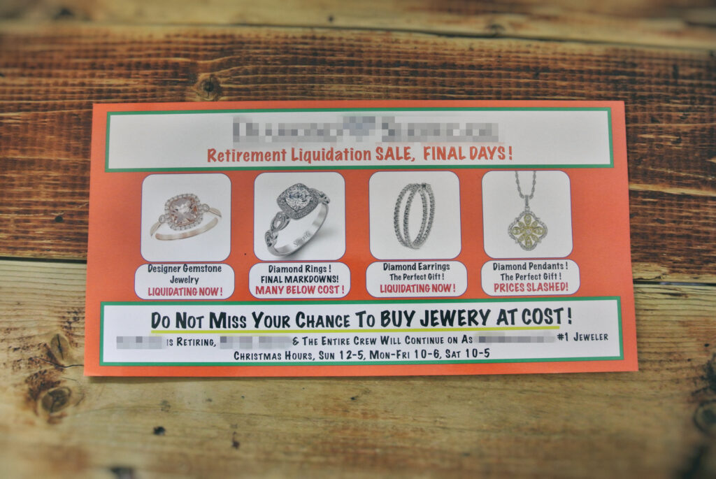
Over the holidays this postcard came in the mail:
As a marketer and designer, I was not surprised.
We all chuck these types of advertisements in the trash.
In this post, I’m going to show you how this postcard could be improved and potentially spared from the waste bin.
Ultimately, my hope is that you can get a better grasp on marketing and design in general after reading.
Let’s get into it!
First, let’s ignore the design.
I’ve blurred out the name of the business including identifiable information to protect the innocent. Plus, I’m not trying to pick on anyone. I only want to dissect a real-life example.
Now that we’ve got that out of the way!
Read both sides of the postcard.

What is this businesses’ offer to the customer?
Why should this customer stop what they’re doing right now and buy jewelry from them?
This business is obviously taking the discounting route.
There’s a liquidation sale because the current owner is retiring. That much is obvious. But, they’ve tried to spin it as if it’s a “going out of business sale.” It’s strange. It’s a forced offer.
They are discounting their jewelry as if the price is the only angle their customers will respond. I’ll get back to this.
What would I have done differently?
Assuming they want to focus on discounting, I would have made it a requirement that the customer bring their postcard to get the discount. That would make people feel that the sale is more exclusive. Verbiage along the lines of “Bring this card for $250 off!”.
It would also be better if an exact discount (like the above) was mentioned with the items on the postcard. Even better, across the entire store.
The verbiage “prices slashed” “liquidating now” “many below cost” etc., reminds me of someone selling a commodity. What exactly does “prices slashed” mean?
Typically, when you need to play the discounting game, it’s generally because you don’t have anything else to offer the customer but a lower price.
At that rate, all your competitor must do is lower their price and they win.
A race to the bottom.
I would recommend appealing to the emotion of the customer. Jewelry is a luxury item, not a power tool. This can be accomplished through the verbiage and the design of the card itself.
Look at any major diamond company’s television advertisement and you get the idea.
Additionally, a start and end date (Three Days Only!) to the sale would also make people more likely to feel pressured to drop by. The postcard says, “Final Days”—what does that mean? There’s nothing on this postcard that makes me believe I need to stop in now or six months from now.
Another impression that I got was that the current owner is retiring and needs to get rid of all the dated jewelry that they have filling up the store. That way the new owner can bring in the new, good stuff. Not something you want your customers to be thinking about.
Now to the design
Jewelry is a luxury item and the design needs to reflect and compliment.
This postcard design could be improved tremendously.
To start, remove all the color and go with only white. That would immediately improve the impression and elegance.
The fonts need to be changed. A pleasant, graceful serif font to match the beautiful jewelry.
Most of the text is uppercase. A very minimal amount (if any) should be uppercase. It’s difficult to read/scan uppercase text and most people just won’t read it.
Details like this matter.
I would remove any red text and replace with only black and greys.
Again, these are elegant products that need an elegant design to match.
Wrapping it up
All the feedback above is a starting place from a marketer’s outside views.
It doesn’t mean that what they’ve created and sent didn’t work, it’s that it could be improved and more effective as outlined above.
As you know, there’s always room for improvement.
Want to Learn About Our Postcard Design Service?
You can read about our print design service here.
You can call or text us (360) 450-3711, too. We’re always happy to help!
Thank you for reading!