
When it comes to shoe store web design, image is everything. Really, image matters with every website. It’s the first-place visitors had an impression of your company. The question is it a good impression, or one that questions the integrity of your business itself?
There might’ve been a time years ago when design didn’t matter as much online. Technology wasn’t where it is today, and expectations were low. A lot is changed. Most people’s interactions online or with major companies. Think Google, Facebook, Pinterest, Instagram, and Twitter. These are major players that have thousands of employees dedicating themselves to making their product and website the best they can. This is the new bar. If were all used to browsing on these platforms, it becomes an expectation that everyone’s website should look this nice and work this well.
Now just imagine your visitor has just come from Pinterest and clicked to your website. Does it measure up? Or does it look like they just stepped back in time? You must keep this in mind if you want to stand a chance online.
Now, let’s look at a website that we designed and developed years ago for a sneaker consignment store in Portland, Oregon called IndexPDX. When the owners first contacted us, they had a successful business running on eBay. They had just secured their brick-and-mortar location in Portland and wanted a web presence for a variety of reasons. The first reason was to obviously sell sneakers online no matter where someone is in the world. The second reason was to have their entire catalog on an iPad that customers could use while shopping. That way if a customer wants something unique that they didn’t see in the store, they can browse their entire catalog right there versus going somewhere else.
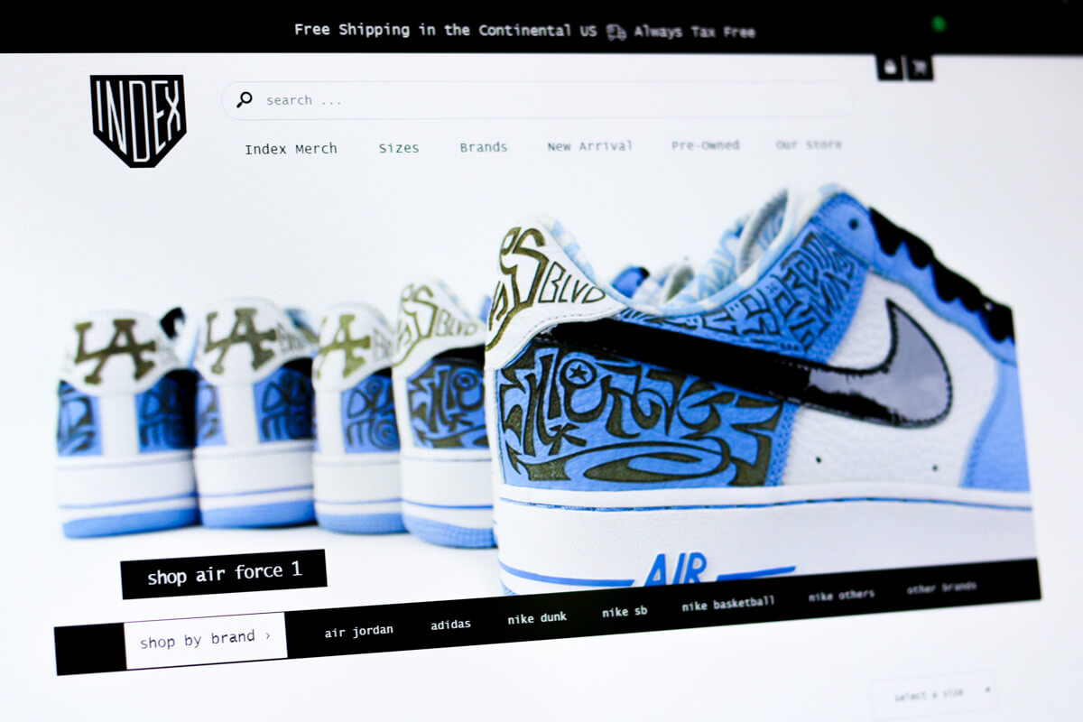
Since we’ve covered the basics of why the website was going to be created, let’s take a look at some design decisions we made throughout the project.
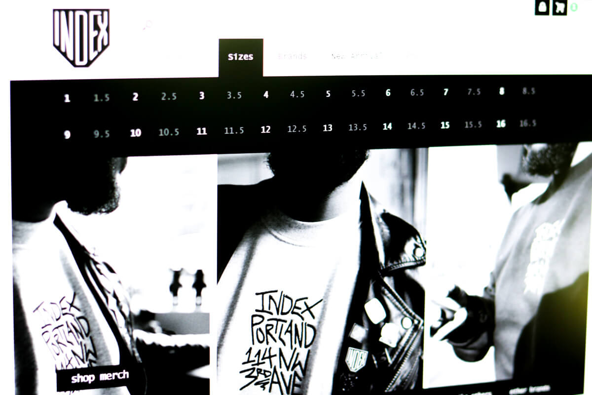
The ability for customers to find what they’re looking for was of utmost importance. After all, people will come to the site not only looking for the shoes but to purchase them. If they can’t find what they’re looking for, they’ll go somewhere else.
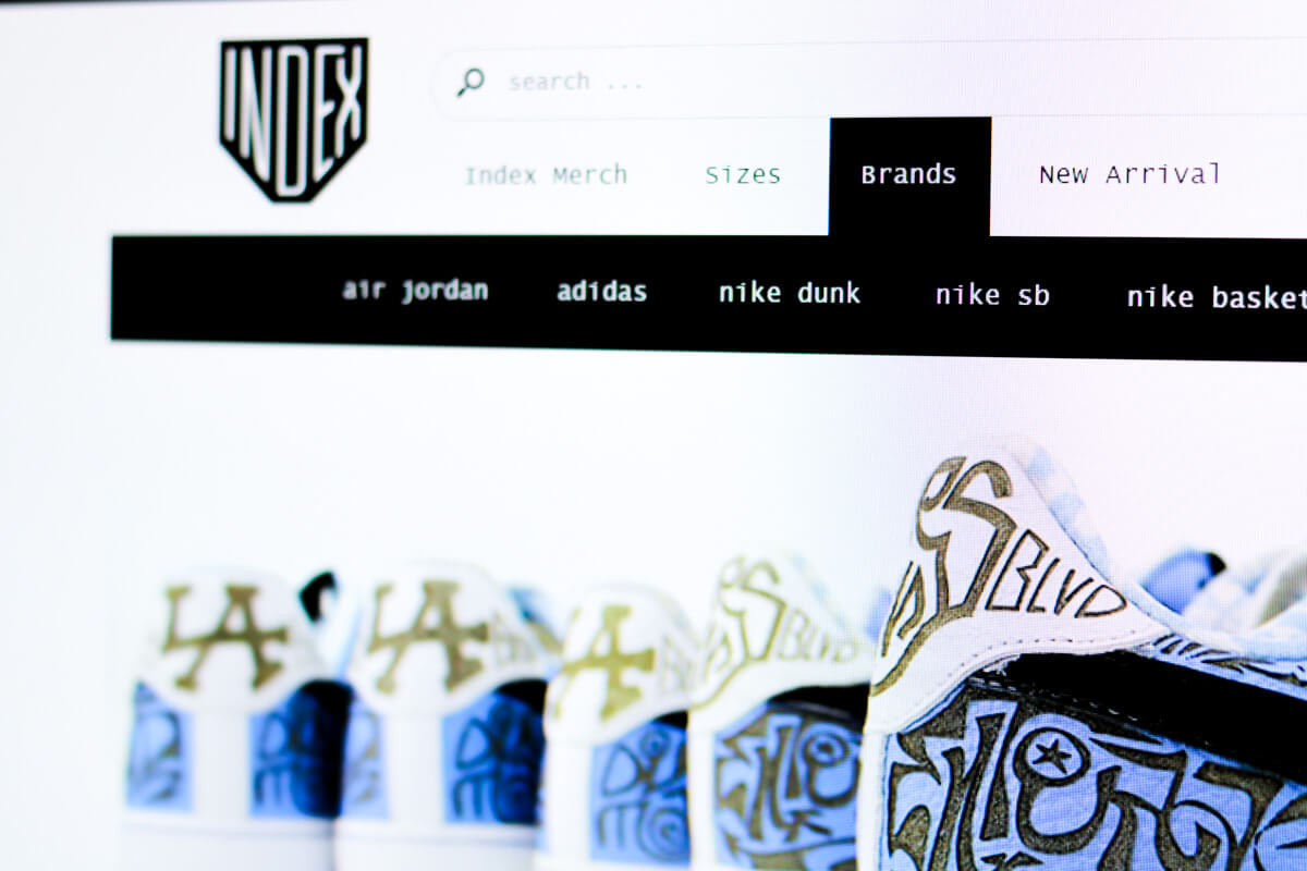
In the main navigation, you’ll see drop downs for sizes and brands that are intuitive.
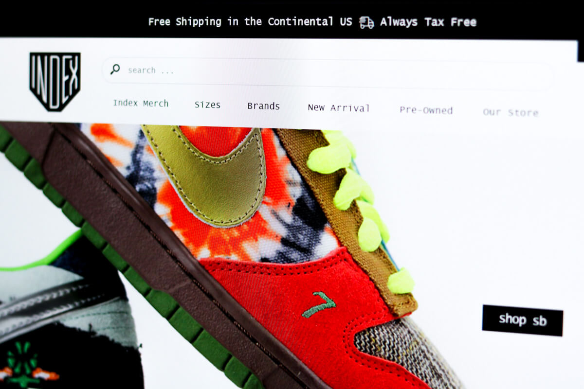
At the top of the screen, you’ll see a notification letting all visitors understand that every thing the order on the store will come with free shipping in the continental United States and is tax-free.
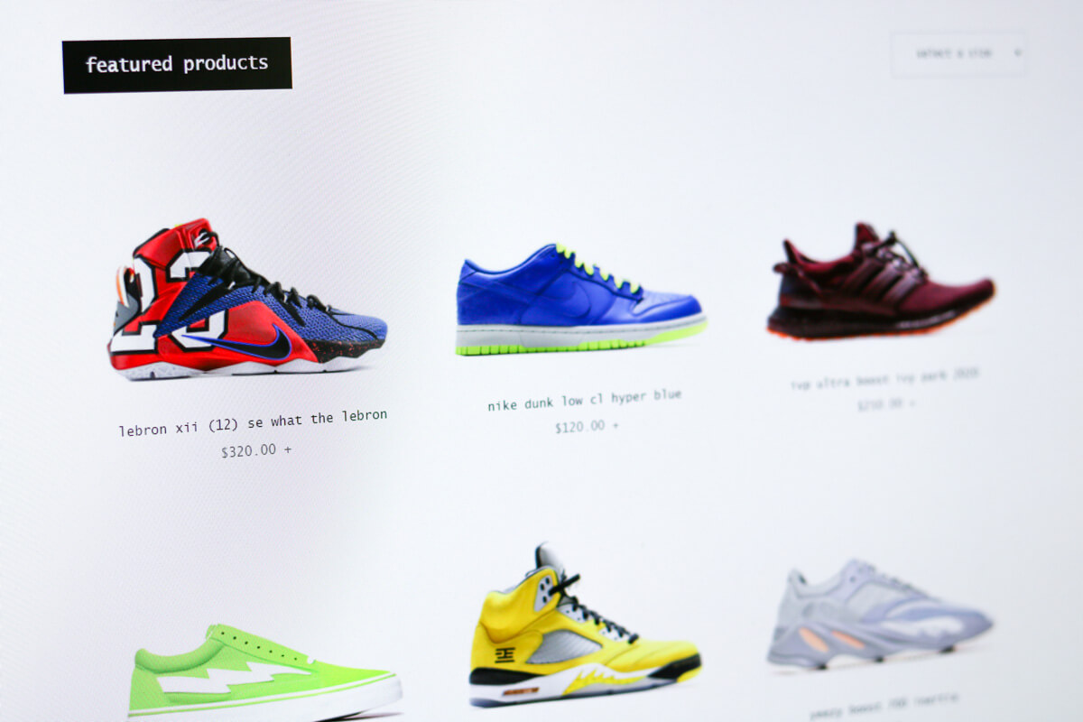
On the front page, you’ll see all the featured products. Generally, these are the shoes that are going to be the most popular with their customers for one reason or another.
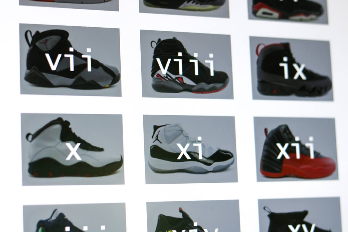
If you’re looking for Air Jordan’s, there’s a page dedicated to each collection.
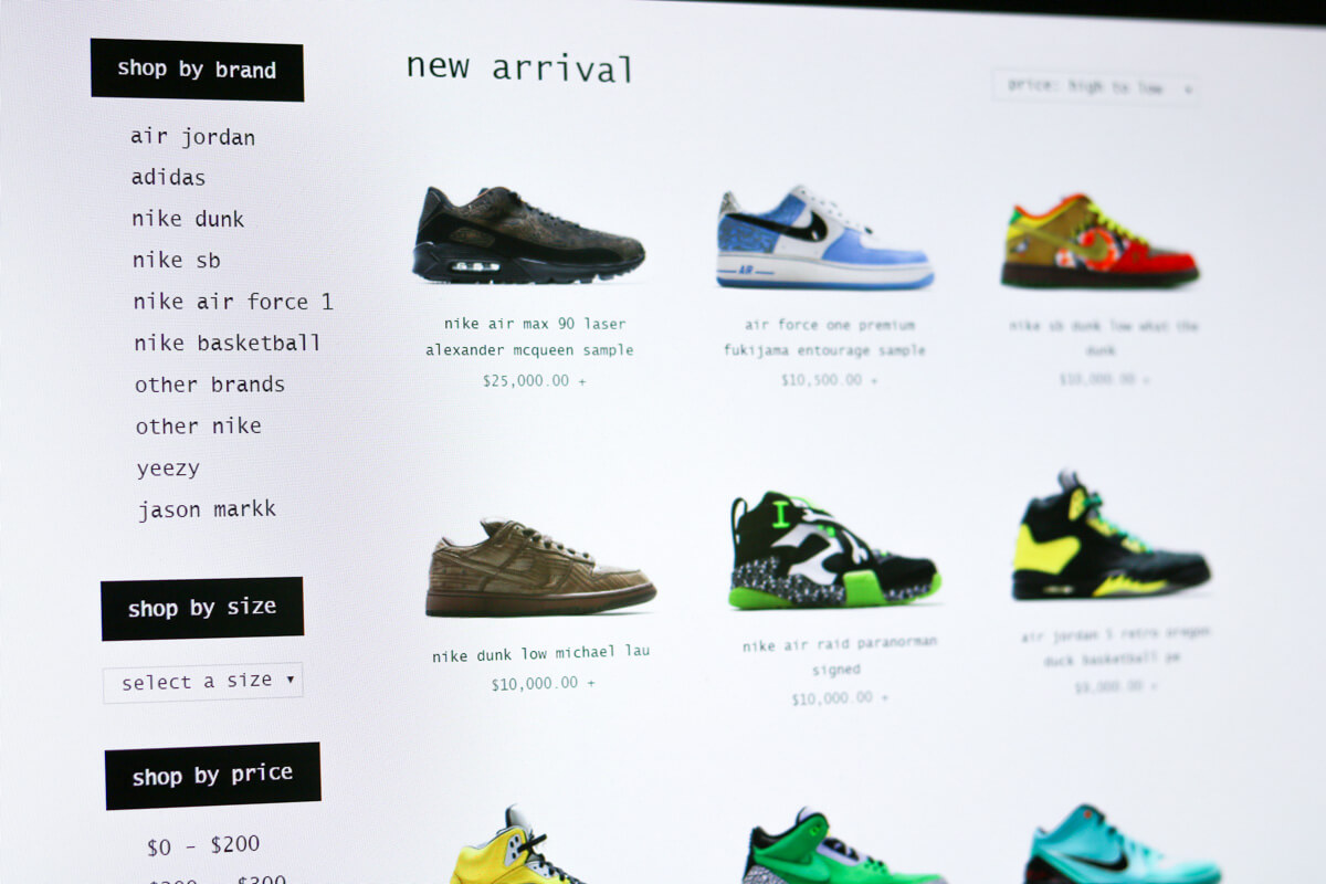
On the category page, there are a variety of filters for the visitor to better fine-tune their search.
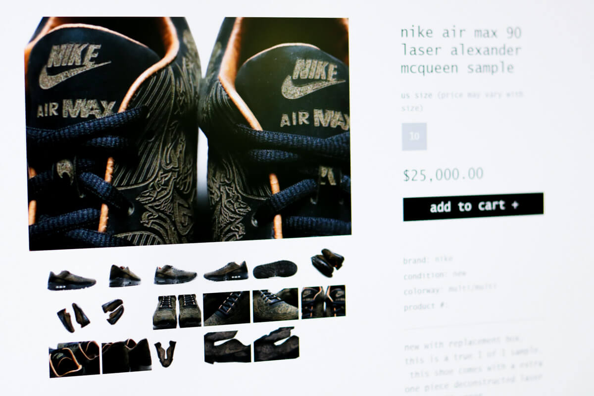
When clicking on a product, the pages straightforward and clean just like the rest of the website. We don’t want to inundate the visitor with a bunch of information that they don’t care about. We also want to keep the design fresh.

One thing you’ll notice, is that the imagery is excellent. The photographer the takes photos of all the shoes does a great job which makes our job a lot easier.
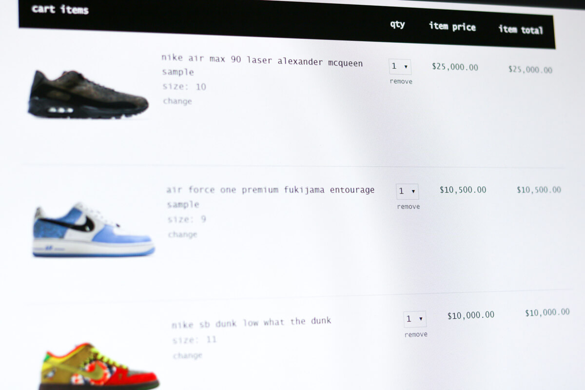
During checkout, the visitor has an option to check out normally or also with PayPal. A lot of their customers prefer PayPal and so this option was necessary.
When customers create an account, they’ll have the ability to track their order and look at order notes. They’ll also be able to see all their previous orders in one place. Everything you’d expect from an e-commerce store.
For IndexPDX, we integrated into their merchant and into UPS’ system for live shipping quotes (outside the continental US). That way orders are priced accurately and turn out as expected for everyone.
eCommerce Web Design
Whether you have an existing e-commerce website or would like a brand-new website, we love to help you. We work with both small and large companies and have the systems and processes in place to ensure a smooth and enjoyable project for everyone.
Let us help you.


