American Crane Training Website Redesign
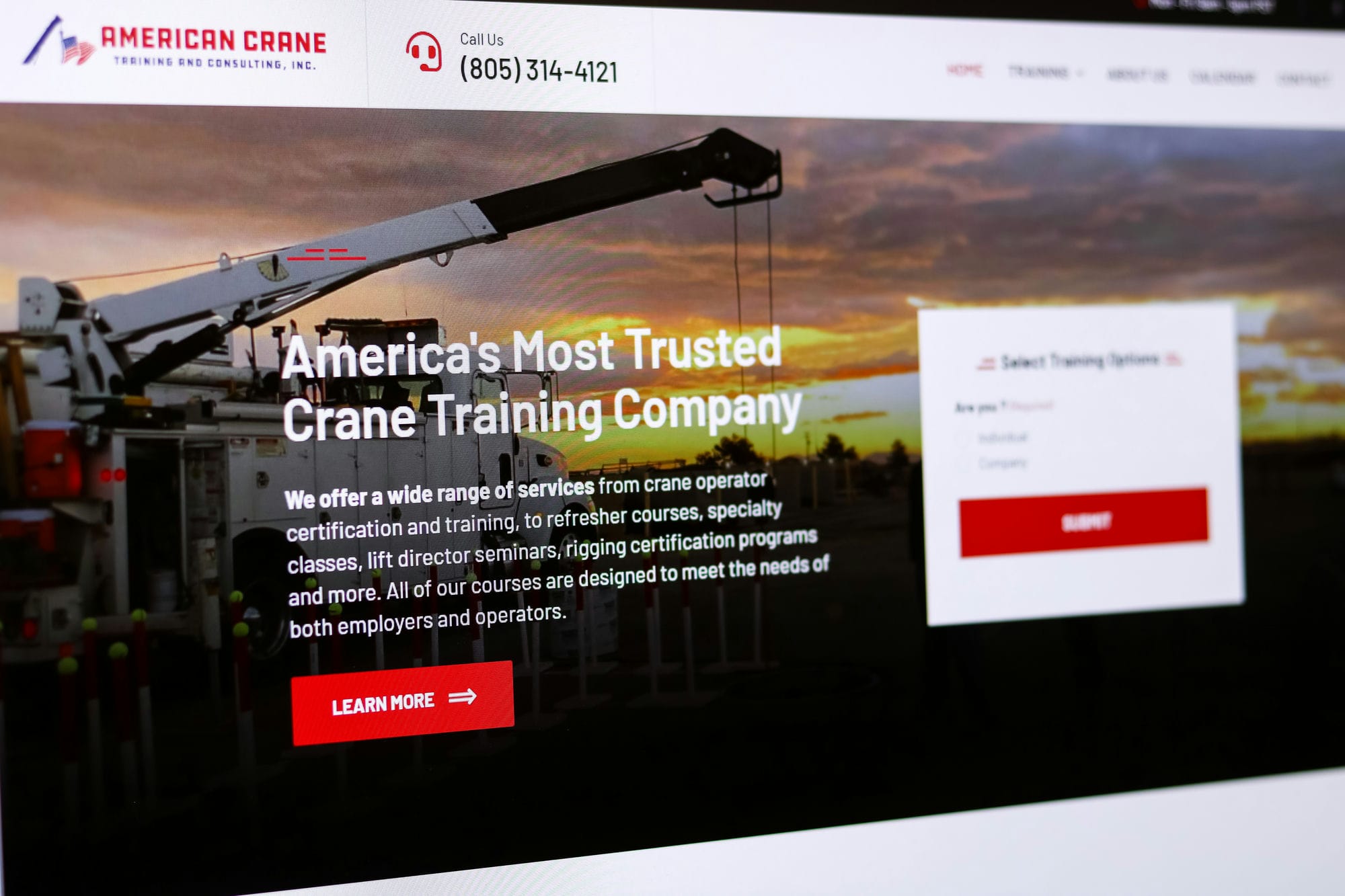
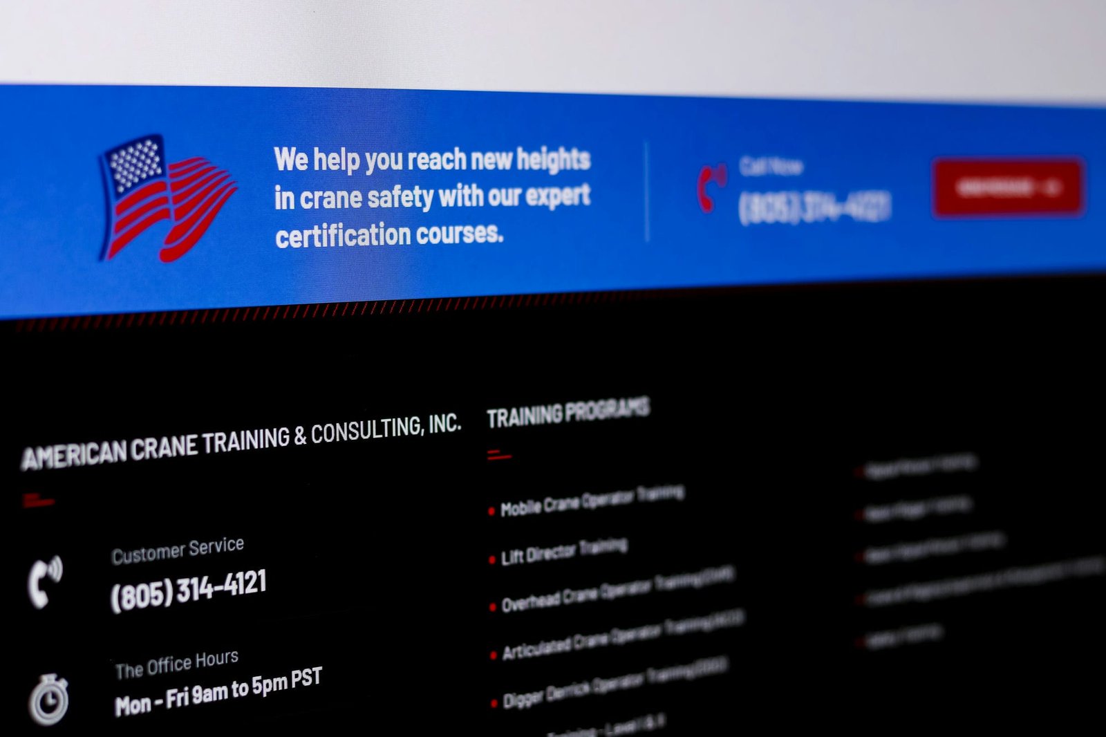
At Graticle Design, we are proud to have recently revamped the American Crane Training website, improving its usability and enhancing its overall user experience. The redesigned site now boasts a more intuitive layout, designed with the end-user in mind. Visitors can easily navigate through the site, find information quickly, and interact with various elements effortlessly.
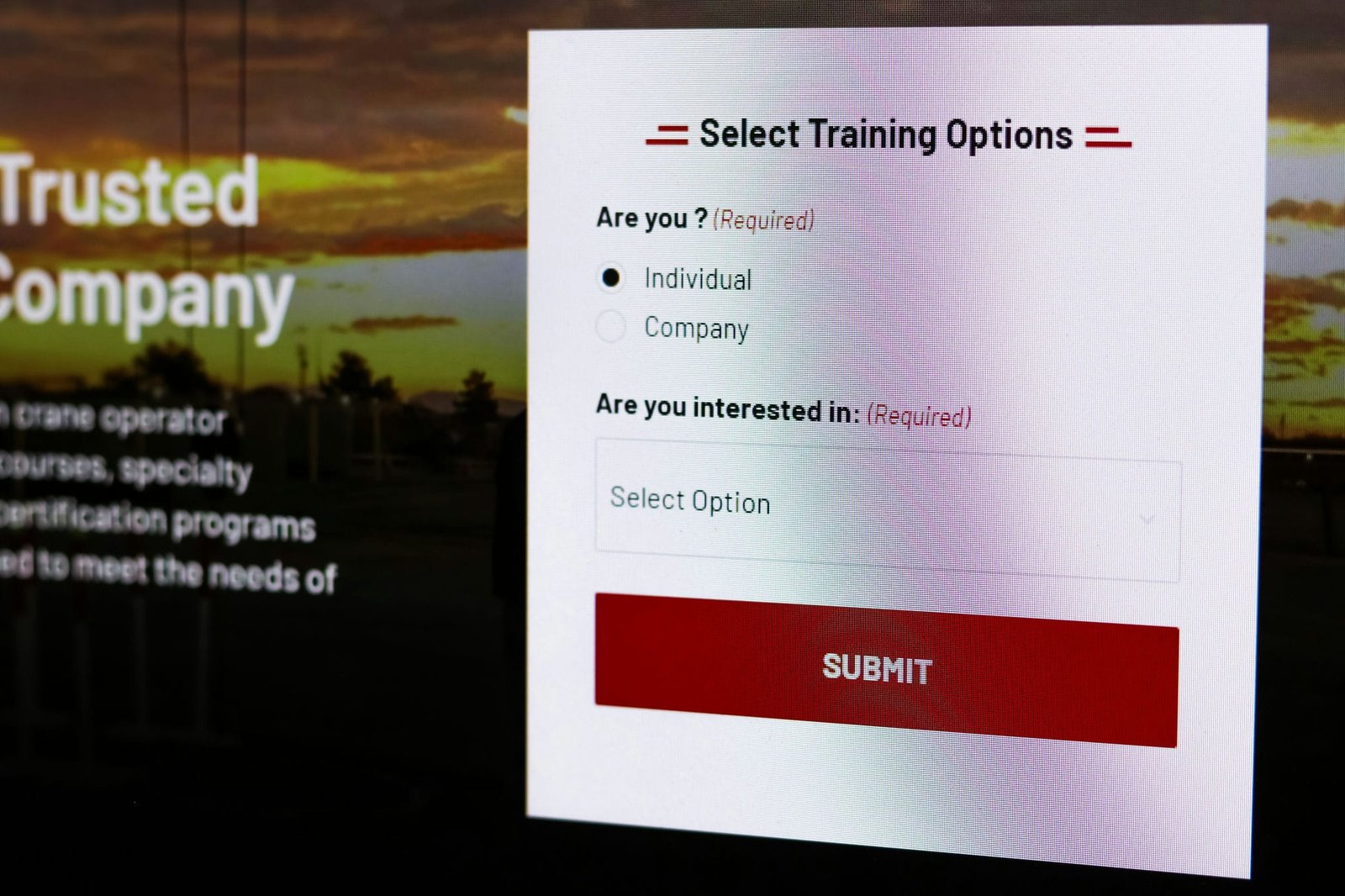
The new website is not just about aesthetics; it’s also about functionality. We strategically incorporated numerous calls to action throughout the site, guiding visitors towards desirable actions and making it easier for them to engage with American Crane Training. Whether it’s signing up for a course, requesting more information, or simply learning about the services on offer, users are now guided through their journey with clear, actionable steps.
One of the most significant improvements is the detailed information on the services provided by American Crane Training. Now, visitors can gain an in-depth understanding of what each service entails, how it can benefit them, and what they can expect when they choose to train with American Crane Training. This transparency not only educates potential customers but also establishes trust and credibility.
Moreover, we’ve incorporated a handy new feature – an interactive calendar showcasing upcoming training sessions. This tool enables visitors to see the dates of future sessions at a glance and arrange their schedules suitably. The integration of this feature has enhanced the user experience, providing a convenient way for potential trainees to stay updated with American Crane Training’s schedule.
In summary, the redesigned American Crane Training website is more than just a fresh coat of paint. It’s a user-friendly, informative, and interactive platform that better serves its visitors and effectively communicates the value that American Crane Training provides.
Services Used
Click on a service below to learn more:
