River Rock General Construction Logo Design
When River Rock General Construction, based in Beaverton, Oregon, came to us seeking a logo redesign, they were in search of something modern, unique, and truly representative of their brand. Their old logo had served them well but was in need of a refresh to better align with their evolved business identity. The challenge was to create something that stood out in a sea of construction logos, while also capturing the essence of what “River Rock” signifies.
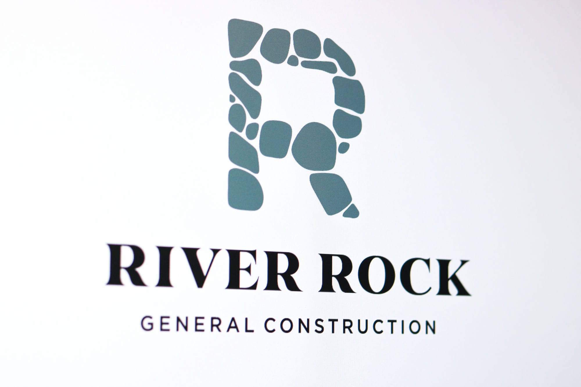
We took inspiration from the company’s name and locale—Beaverton, just outside of Portland, Oregon, an area known for its natural beauty—to create a logo that was both aesthetically pleasing and conceptually relevant. The key element we focused on was the “R,” which we designed using smooth, rounded shapes reminiscent of river rocks. These shapes not only gave the logo a unique, recognizable look but also encapsulated the organic, down-to-earth aspect of the River Rock brand.
The end result is a logo that stands alone in its creativity and professional appeal. It’s not just an “R” but a symbol that tells a story—a story of a company rooted in its community, committed to quality construction, and unique in its approach. In a competitive market, especially one as bustling as the area around Portland, having a distinctive logo like this can be a major asset. River Rock General Construction now has a logo that is as modern, professional, and unique as the services they offer. It’s a visual identity they can proudly stand behind, and there’s truly nothing out there like it.


Services Used
Click on a service below to learn more:

