Logo & Brand Creation
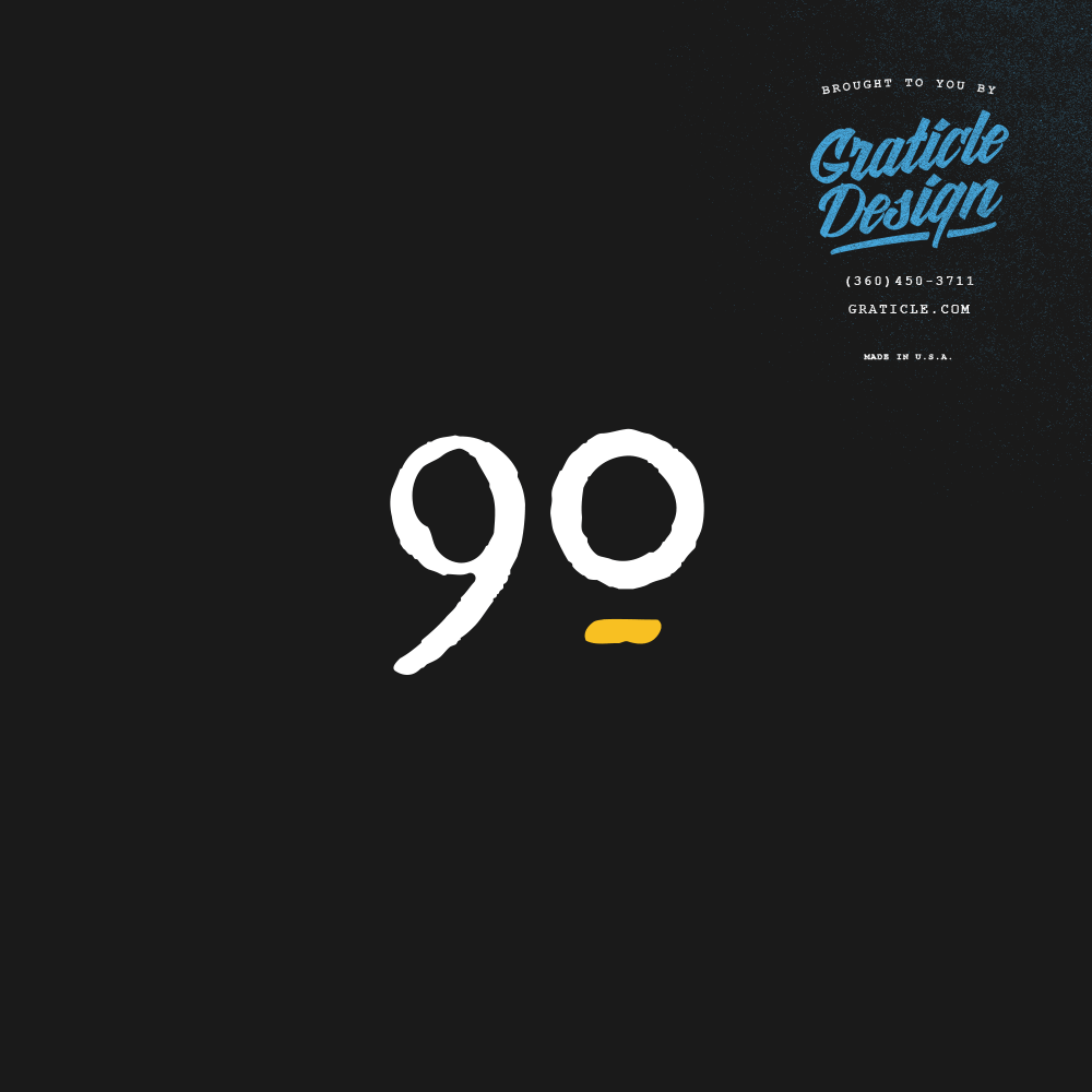
The logo and brand identity designed for “90 Day Double” encapsulate the essence of transformation and dynamic progress. The prominent “90” set boldly at the logo’s forefront serves as a constant reminder of the program’s time-bound nature, suggesting efficiency and the power of a targeted 90-day period. The use of the word “DOUBLE” in conjunction with this timeframe implies a promise of exponential growth and achievement. The varying backgrounds of the logo—ranging from a sophisticated dark theme to a clean white, and a rich gold accent—speak to the brand’s versatility and its appeal to a diverse audience. The choice of a minimalist font emphasizes clarity and focus, which are crucial for clients aiming for rapid advancement. The overall design is not just a visual mark but a statement of the brand’s commitment to unlocking potential and fostering swift, tangible success for its clientele.
Services Used
Click on a service below to learn more:


