
Print design · Home buying guide · Real estate, California
Laurel Properties: a home buying guide that makes a first impression.
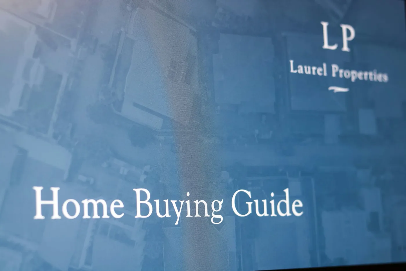
Laurel Properties, a California real estate firm known for personal service and buyer education, asked us for a Home Buying Guide. Often the first thing a buyer received, it had to be informative and striking. We designed a sleek, modern guide with strong contrast so every page stands out.
What We Made
Home buying guide
A multi-page guide for new buyers.
Modern design
Bold contrast and clean layouts.
Brand fit
Confident design that matches the firm.
About the Design
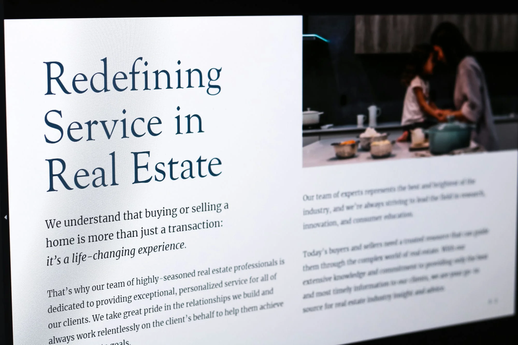
The guide pairs a classic serif headline, “Redefining Service in Real Estate,” with a short italic line about buying a home being a life-changing experience, and a large photo of a family in a kitchen. Generous margins, dark navy type and a clean grid give each page a calm, confident look.
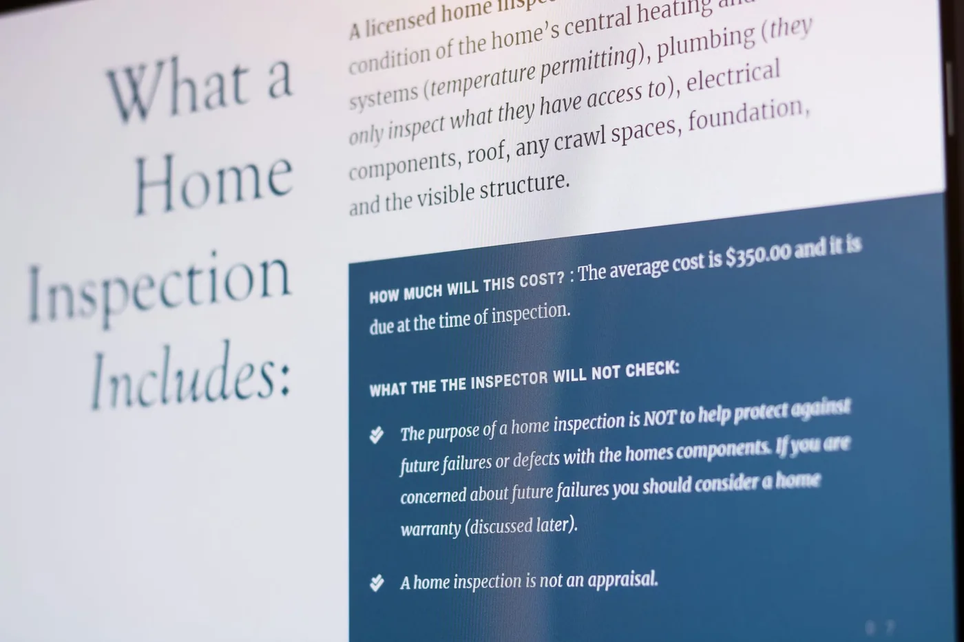
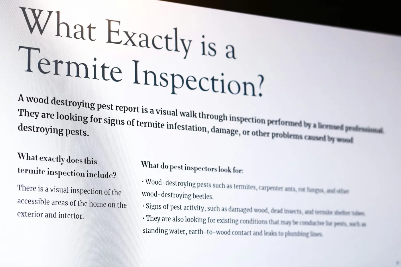
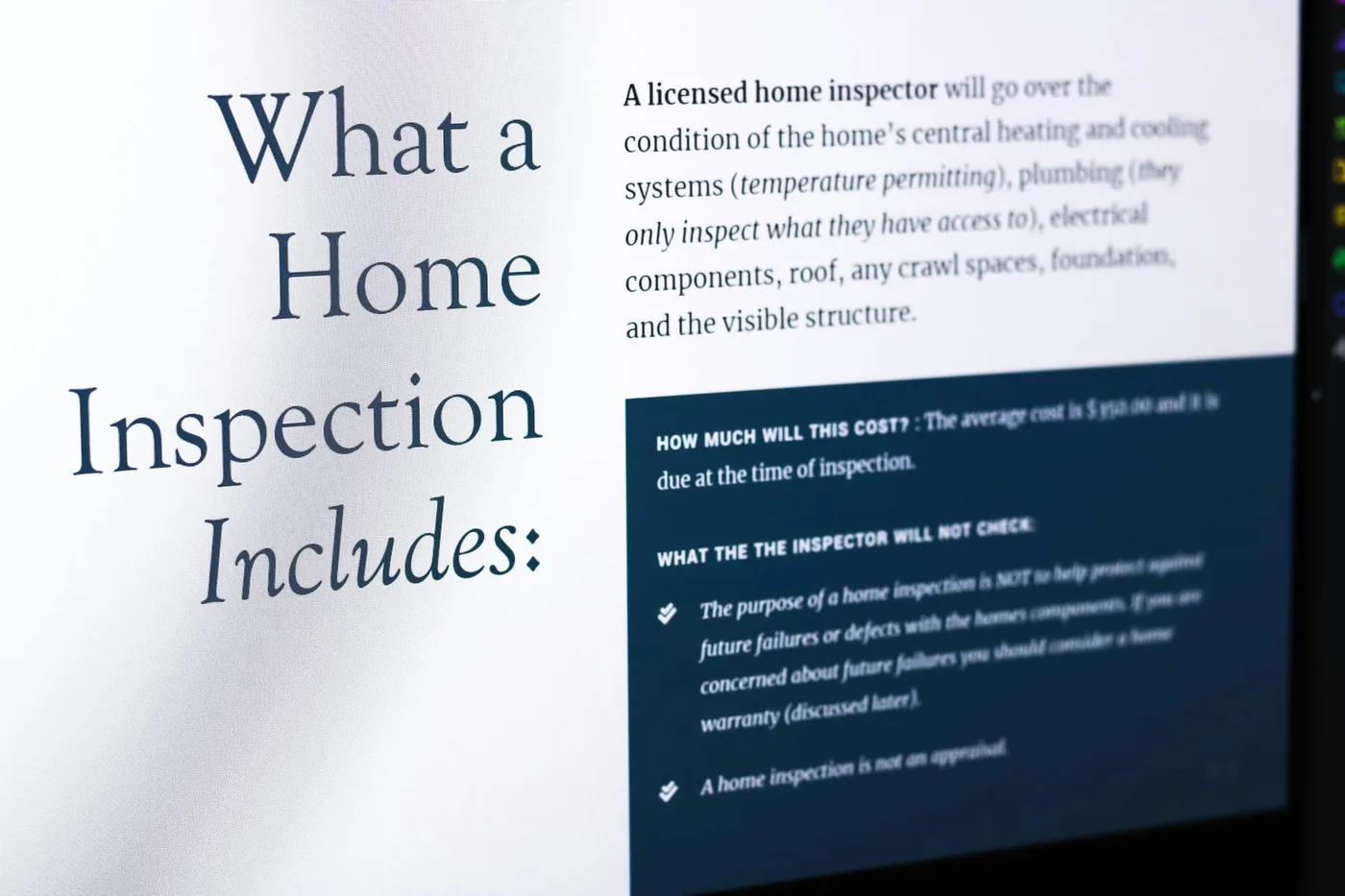
Strong contrast between the photos and the text keeps the guide readable, whether it is printed or sent as a PDF. Because it is often the first thing a buyer receives from the firm, the design does as much to build trust as the words do.
More From This Project
Need Print Design Like This?
Brochures, menus, cards, booklets and signs, designed to match your brand and ready for the printer. Tell us what you need and we will send a clear quote.
Related Work
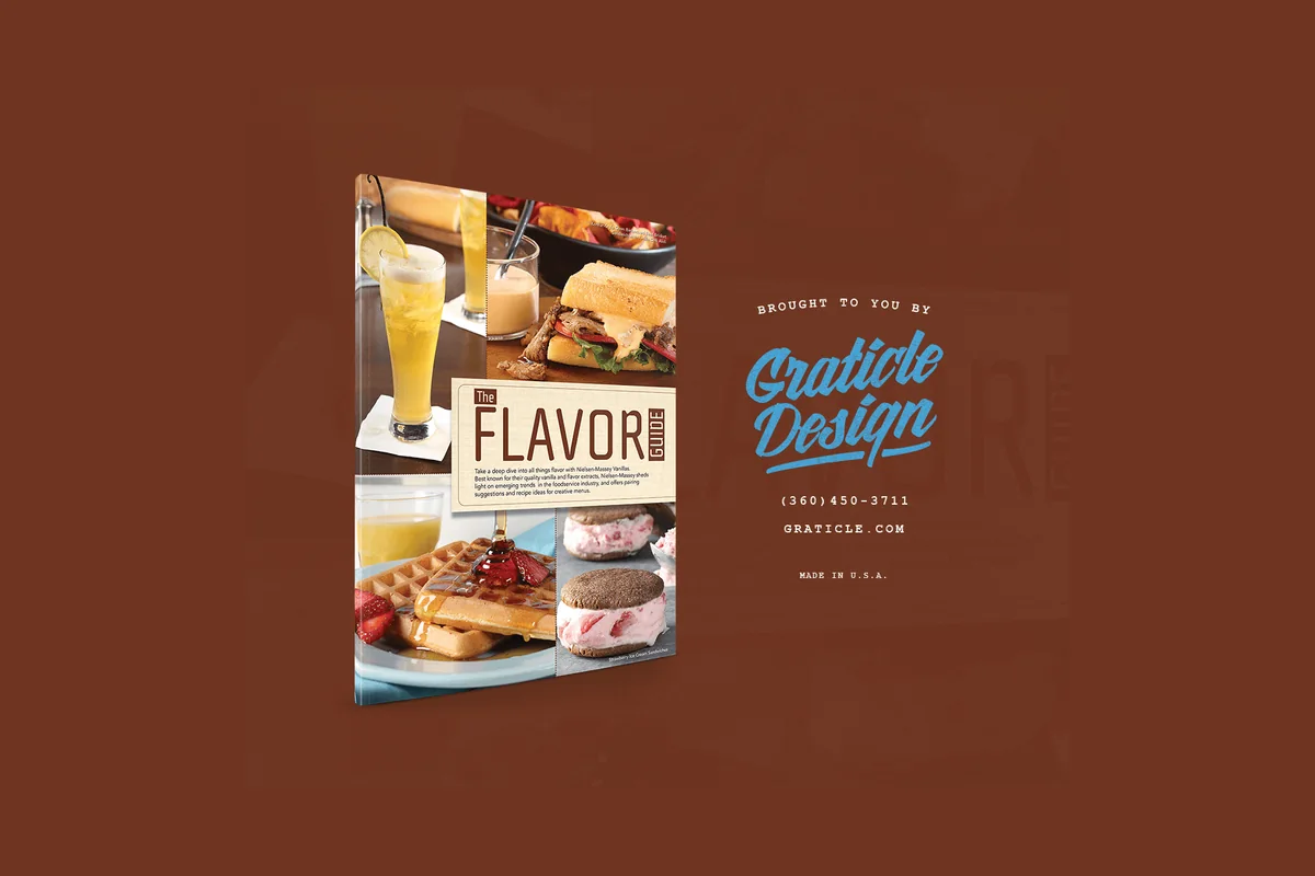 Nielsen-MasseyPrintNielsen-Massey Vanillas makes pure vanilla and flavors for home bakers, chefs and food makers around the world.
 Port of LongviewPrintThe Port of Longview is the first operating port on the Columbia River’s federally maintained deep-draft shipping channel, a hub for global cargo.
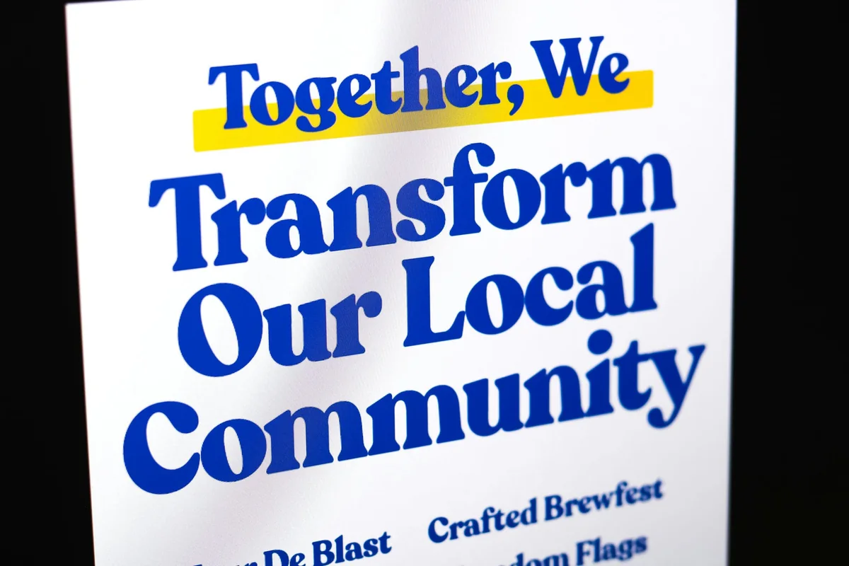 Rotary Magazine AdvertisementPrintWe designed a one-page magazine ad for the Rotary Club of Longview in a Kelso Longview Chamber of Commerce publication.
Want results like this?
Tell us what you need printed or designed and we will send ideas and a clear quote.
Start a design projectNot ready yet? Get a free website audit and we will tell you what is worth doing first.
