Logo Design
Cascade Tools: Building a Brand as Strong as Their Tools
When Cascade Tools approached us, they had a clear mission: to sell top-notch tools that make tasks easier, from upholstery projects to building cages. Their high-quality hog ring pliers and paint accessories are all the rage on Amazon, but they needed a brand identity that would not just match the quality of their products, but elevate it.
Color Palette: Green & Black
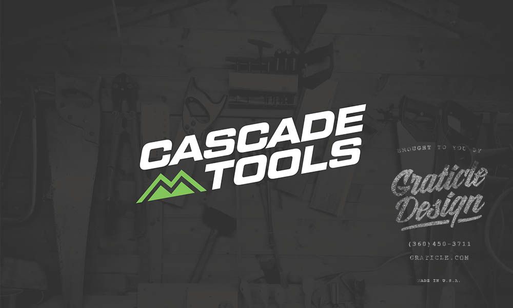
Our first step was to give life to Cascade Tools through vibrant colors that demand attention. We went with a bold combination of green and black. Green signifies growth, efficiency, and durability, while black adds a level of sophistication and strength. This dynamic duo is as eye-catching as it is memorable, making sure that Cascade Tools stands out in a saturated market.
Logo Design: Simplicity Meets Strength
For the logo, we wanted something that immediately says “reliable.” We merged modern design elements to symbolize both utility and robustness, mirroring the reliability that Cascade Tools brings to the table. The end result is a logo that’s as straightforward and efficient as the tools it represents.
Brand Voice: For the Doers
Crafting the brand voice, we focused on the practical, no-nonsense user. We aimed for a tone that speaks to the “doers”—those who want their tools to work as hard as they do.
Overall Impact
Cascade Tools’ new branding has hit the nail on the head. From their Amazon product listings, the fresh look and feel have garnered more visibility and instilled a sense of trust among customers. The brand is now not just a name but a symbol of durability and reliability.
Services Used
Click on a service below to learn more:
